Add UI components
Components Library
In App Designer, locate the Plugin panel and click  to open the Components Library.
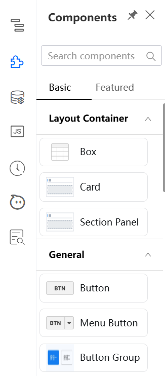
On the Basic and Featured tabs, the following categories of components are available for drag-and-drop:
- Basic
- Featured
Drag-and-drop
In the Components Library, type the keywords to search for the component you want.
In the following example, you will drag a box component and drop it on the canvas.
-
Find the box component and drag it to the canvas.
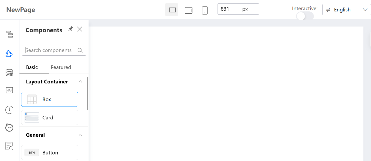
-
Move the box component over the canvas.
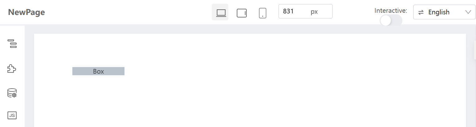
-
Place the box component at the place you want.
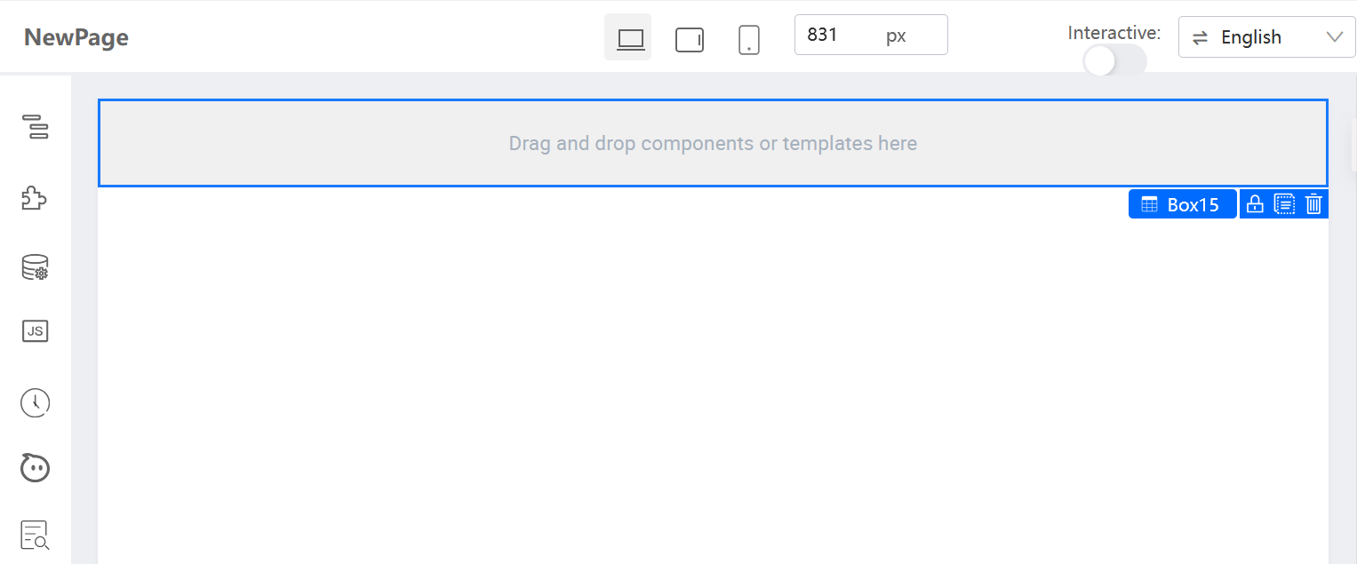
-
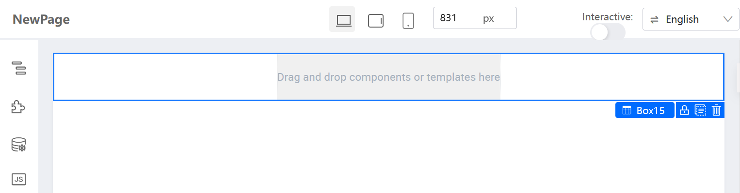
Similarly, drag a cell and drop it inside the box.
Component Tree
To view the page structure in a straightforward way, click  to open the Component Tree.
In this example, it shows the box contains the cell. When you select any component from the tree, the canvas will reflect it immediately.
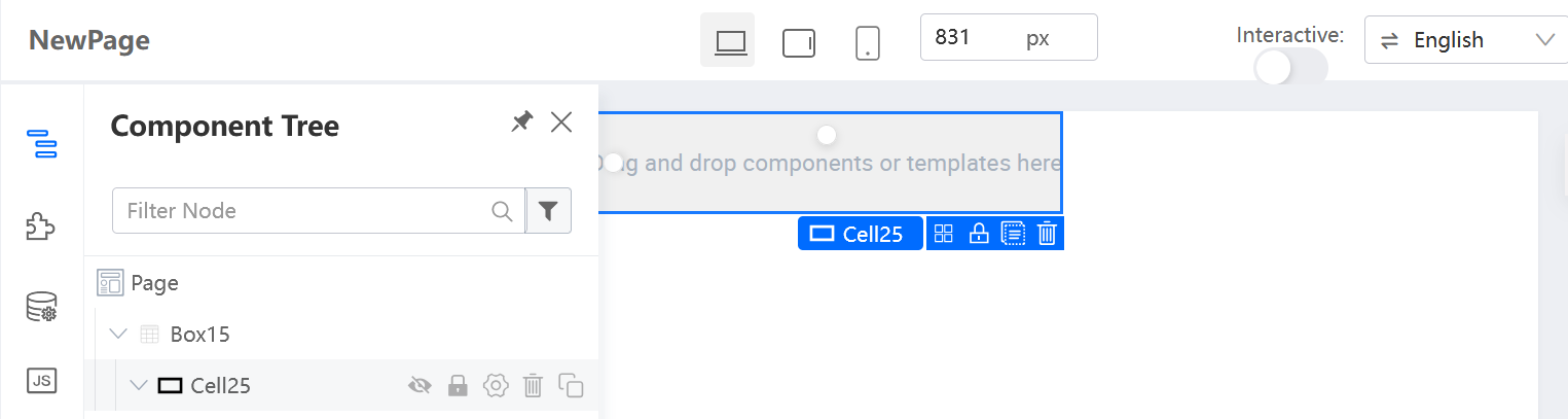
You can also perform the following actions to the specified component:
- Show or hide: Toggle its visibility.
- Lock or unlock: Make it editable or read-only.
- Rename: Give it a meaningful name for easier recognition.
- Delete: Remove it from the canvas.
- Duplicate: Copy it for duplication.
Setter Plugin configuration
For more information, refer to Layout container components or other component articles.
Last updated on 20 May 2026