Design charts
Charts are the fundamental, self-contained building blocks for dashboards. Drag the charts to the canvas and configure the settings for data visualisation.
In the Components Library, the EChart component includes these types of charts:
-
Bar: Compares different categories of data using bars. Choose this for comparing data from different groups.
-
Line: Tracks how data changes over a continuous interval. Choose this for visualising trends, cycles, or fluctuations over time.
-
Pie: Shows the proportional distribution of a single data set. Choose this for showing compositional relationships.
-
Scatter: Displays the relationship between two numerical variables. Choose this for identifying patterns, correlations, or outliers between data points.
Create an EChart from existing code sample
You can create an EChart based on code samples from existing online resources in the following method:
-
Open the Source Code Panel using one of the following methods:
- From the Props tab
- From the Plugin panel toolbar
Select the ECharts component on the canvas, then enable the Custom Option toggle on the Props tab.
The Custom Js property appears. Click Remove Binding, then click the Bind Function button.
On the Event Binding window, click Confirm.
Alternatively, select the ECharts component on the canvas, then click the Source Code Panel icon
 on the Plugin panel toolbar.
The Source Code Panel opens.
-
In your browser, visit the ECharts official site. Observe the chart samples and find one that fits your project requirements.
-
Click the chart sample to view its source code. Select all the code and press Ctrl + C to copy it.
-
Paste the code for the chart sample into the ECharts component's Source Code Panel.
-
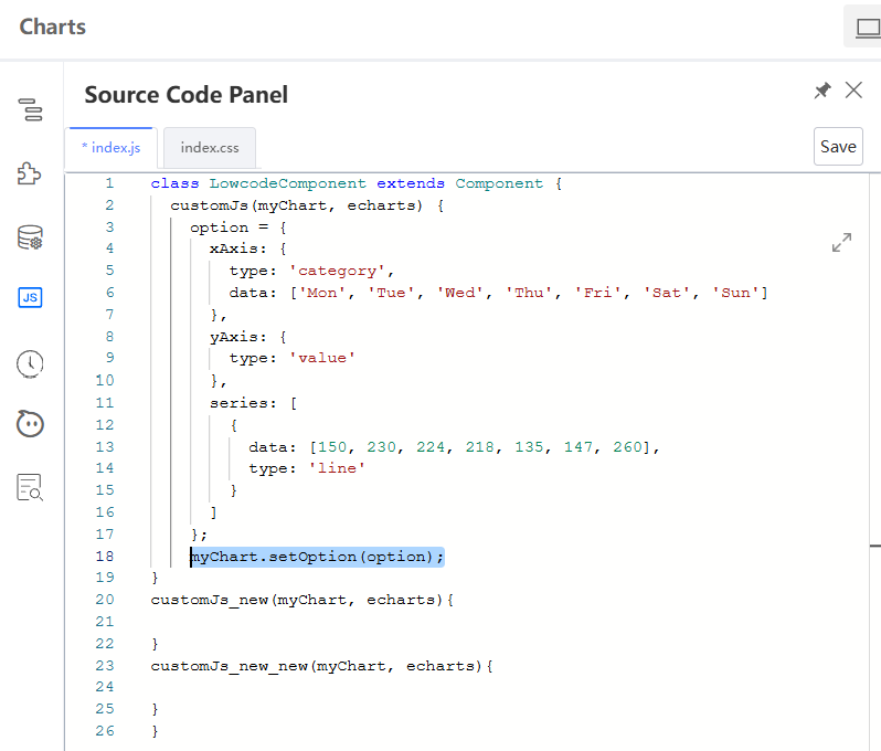
Add the following line of code into the Source Code Panel after the
;, which marks the ending ofoption:
myChart.setOption(option);
The following shows an example:
Create ECharts from scratch
The following examples describe how to create two commonly-used charts.
The examples use static JSON data. You have the option to connect to a datasource using Variable Binding.
Create a bar chart
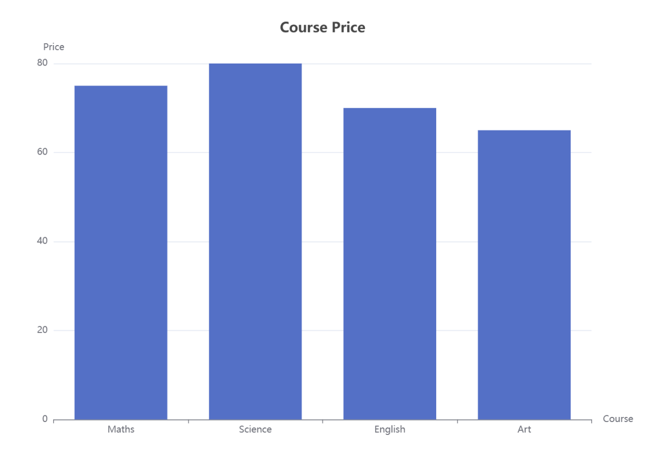
In this example, use a bar chart to compare the course price.
-
In the App Designer, from the Components Library, search for ECharts and drag it to the canvas.
-
On the Props tab, in the Chart type dropdown, select Bar.
-
On the Props tab, click Edit data to add the following value into each corresponding section and click Confirm.
-
Chart data:
[75, 80, 70, 65] -
Title:
{"text": "Course Price","left": "center"} -
XAxis:
{"data": ["Maths", "Science", "English", "Art"],"name": "Course"} -
YAxis:
{"name": "Price"}
-
-
In the Styles tab, set the Width and Height to a value in pixels or a ratio in percentage. Customise other settings as you need.
The output will look like the following:
Create a pie chart
In this example, use a pie chart to show student enrolment by course.
-
In the App Designer, from the Components Library, search for ECharts and drag it to the canvas.
-
On the Props tab, in the Chart type dropdown, select Pie.
-
On the Props tab, click Edit data to add the following value into each corresponding section and click Confirm.
-
Chart data:
[{"data": [{ "value": 23, "name": "Maths" },{ "value": 27, "name": "Science" },{ "value": 30, "name": "English" },{ "value": 20, "name": "Art" }]}] -
Title:
{"text": "Course Enrollment","left": "center" } -
Tooltip:
{ "trigger": "item" } -
Label:
{"show": true,"formatter": "{b}: {d}%"} -
Legend:
{"top": "30","left": "center"} -
XAxis:
{"data": ["Maths", "Science", "English", "Art"],"show": false}
-
-
In the Styles tab, set the Width and Height to a value in pixels or a ratio in percentage. Customise other settings as you need.
The output will look like the following:

For more details on how to create charts, refer to ECharts components.
Change the chart type
You can change the chart type only when the Custom option toggle is disabled.
After creating a chart, you can change it to another type by performing the steps below:
-
Select the chart you have created.
-
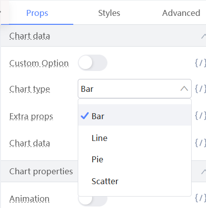
On the Props tab, find the Chart type dropdown.
-
Select a different type. The EChart will change immediately.
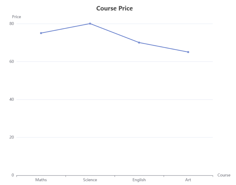
Take the bar chart for example. If you choose the Line type, it will change into the following:
Transform charts into a dashboard
After placing and configuring the chart components, you transformed the interactive "building blocks" into a dashboard.
In the Preview mode, you can perform the following:
-
Hover for details: Move the mouse over any bar or pie slice to see a tooltip with its precise category and value.
You can drill down into specific data points without a separate table.
-
Use the interactive legend: You can click items in a legend to dynamically toggle the visibility of data series in the chart.
This helps you filter the visualisation in real time.
By combining chart components, you can build a comprehensive and interactive report or dashboard that transforms raw data into clear, actionable insights for end users.
Last updated on 20 May 2026