App Designer overview
KAIZEN App Designer is a visual environment to create the frontend user interface for your application. It helps you design responsive layout with pre-built components on a visual canvas through drag-and-drop and minimal coding.
App Designer is built for team collaboration. Team members contribute to a project without overwriting each other's work, with a clear revision history of their contribution to the application.
In KAIZEN studio console, find your app and click  to open the App Designer.
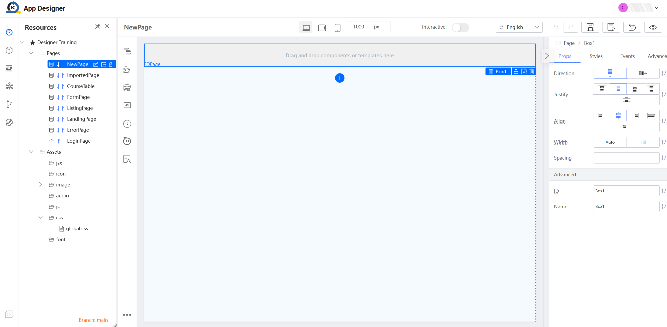
Resources panel
Located on the top left, this panel manages your application's lifecycle. It helps you organise pages, configure application properties, manage profiles, connect to external services or Git repositories, and customise the theme.
-
Resources: Organise your pages and assets, including images, JavaScript files, CSS and more.
-
Libraries: A collection of reusable code and resources (e.g., JavaScript or CSS) that can be imported into a project to provide pre-built functionalities. Libraries save time and effort by eliminating the need of creating common features from scratch.
-
Profiles: Create new profiles and switch to a dedicated profile for a different server environment (e.g., local development, UAT, or production).
-
Services: Add or import a service, switch branch for Git version control, and view inactive services or datasources. For more details about creating and managing backend microservices and APIs, refer to Service Designer overview.
-
Git: Manage Git configurations for your project. It connects the project to a remote Git provider for version control purposes.
-
Theme: Search for a theme, switch version from a list of themes, and apply a theme to your app. For more details about customising the app appearance, refer to Theme Designer overview.
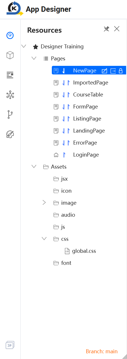
Plugin panel
This panel provides the essential tools to build and analyse your pages. It contains the component library, datasource connections, quality assurance tools like page scanning and more.
-
Component Tree: This is an overview that shows the hierarchical structure of the project components. It organises the UI components into a tree structure.
-
Components Library: This provides a collection of pre-built components for the user to search, then drag and drop into the canvas. It serves as the building block for the application frontend.
-
Datasource: Click this tab to manage the data connection or repository from which the application retrieves information.
-
Source Code Panel: This is the place that provides direct access to the code level of the application, where you can view and edit the underlying source code for a deep level of customisation.
-
Revision: This provides a version history to track changes made by various team members to the project. You have the option to revert to an earlier state, as long as it is captured in Revision.
-
Comment: Click this tab to add a comment, control its visibility, or respond to someone else's comment. Comments provide explanations and insights for team collaboration.
-
Page Scan: This is a tool to check and analyse the potential issues of the project or application. It helps enhance the overall quality and performance.
-
Schema: Click
 at the bottom to view or edit the code for all components on your page. It allows you to view the overall structure at a glance and provides the flexibility for you to customise the code according to your project requirements.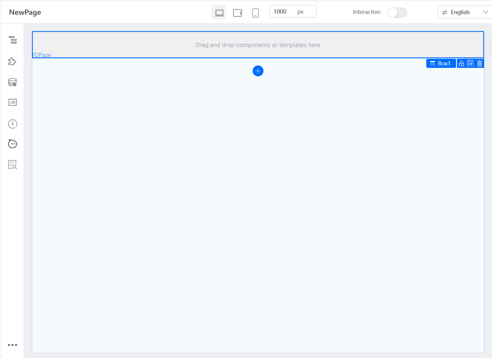
Revision history
In App Designer, each page has its own revision history to help you track all changes over time. Every revision is automatically recorded whenever assets are updated, when the page is previewed, or when you manually publish it with custom comments.
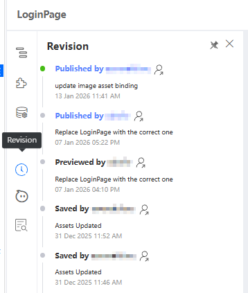
Canvas
This is the central workspace (see above) where you drag and drop UI components to arrange your application's frontend and preview the responsive layout.
-
PC layout: This shows how your application appears on a PC screen.
-
Tablet layout: This helps you preview how your application looks like on a Tablet screen.
-
Mobile layout: This displays the look & feel of you application on a mobile screen.
-
Resolution: This is the place for you to configure the screen width (in pixels) for preview purpose.
-
Interactive: A toggle that helps you enable or disable the interaction mode. If enabled, the event datasources can be triggered in the App Designer.
-
Languages: A dropdown for you to choose in which language your application should use.
-
Undo: A button to reverse the last action.
-
Redo: A button to restore the action that was just undone.
-
Save Draft: Click this button to save your current changes into a draft. The draft will appear in the revision history. However, to prevent any data loss, you need to publish the page as shown below.
-
Publish Page: Click this button to add comments and publish your page, to make any changes take effect and reflect in the revision history.
-
Reset Page: This helps you reset your page to the initial state. Before resetting, confirm to validate all your edits will disappear.
-
Preview: Click this button to view your page. This will automatically saves your draft into the revision history.
Setter Plugin
-
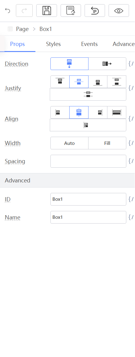
Props: This is the place to configure the properties for the specified UI component, with contextual options such as layout settings, width, height, ID, name and more.
-
Styles: This defines the CSS setting and style of the specified UI component. Be sure to click Save after changing anything manually. For more information, refer to Styles.
-
Events: This tab displays only for certain components, e.g., card and button. Click Component native event to bind event, which will be triggered by a click on this component.
-
Advanced: This provides additional control settings for the component visibility, loop settings, render unique identifier (key), and reference ID. For more information, refer to Advanced.
Last updated on 20 May 2026