Styles tab
The Styles tab allows you to customise the visual appearance of the UI components through both CSS code and a visual editor.
ClassName
A text input where you can enter custom CSS class name(s) to apply additional styling. Supports variable binding via this icon  .
.
If you want to add a className e.g., my-custom-button to a button, be sure to define it properly at the project level or within the application:
-
At project level: Define the
classNamein theglobal.cssfile under theAssetsfolder on the Resources panel. Then you can select the button and entermy-custom-buttonin the ClassName to apply the effect.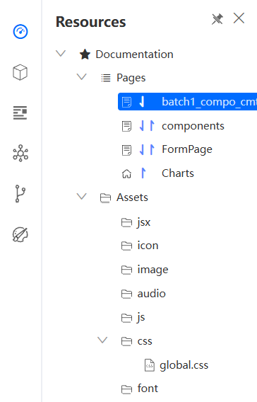
-
Within the application: Define the
classNamein theindex.cssfile in the Source Code Panel.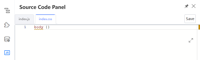
Responsive
A radio group (Global | Device) that controls whether style overrides apply universally or per device type.
- Global — Style changes apply across all device sizes.
- Device — Style changes apply only to the currently active device breakpoint (PC, tablet, or mobile), allowing different styles per device.
The Responsive option is only available when the Advanced Responsive toggle is enabled in the Create or Edit Application window.
Css
A code editor that lists out all the child classnames of the selected component. Supports variable binding via this icon .
Style
A code editor for inline style overrides. Click Save to apply changes. Supports variable binding via this icon .
Layout
A visual editor for configuring the component's layout properties:
- Layout pattern — Sets the CSS
displaymode for the component. Choose from the following patterns:- Inline — Displays the component inline with surrounding content
- Flex — Enables flexbox layout for the component. When selected, the following additional properties appear:
- Direction — Sets the main axis direction of flex items (
row,row-reverse,column,column-reverse) - Justify — Controls how flex items are distributed along the main axis (
flex-start,center,flex-end,space-between,space-around,space-evenly) - Align — Controls how flex items are aligned along the cross axis (
flex-start,center,flex-end,stretch,baseline) - Wrap — Controls whether flex items wrap onto multiple lines (
Nowrap,Wrap,Wrap-reverse)
- Direction — Sets the main axis direction of flex items (
- Block — Displays the component as a block-level element
- Inline-block — Displays as inline but allows width/height settings
- None — Hides the component from the page layout
- Padding — Set the inner spacing (top, right, bottom, left) in pixels
- Margin — Set the outer spacing (top, right, bottom, left) in pixels
- Width / Height — Set explicit dimensions in pixels or percentage (%)
Font
Configure the text appearance of the component:
| Property | UI Control | Description |
|---|---|---|
| Font size | Number input (px) | Sets the font size of the text |
| Line height | Number input (px) | Sets the line height of the text |
| Font Weight | Dropdown | Select the font weight (e.g., normal, bold) |
| Font family | Dropdown | Select font family, including those uploaded into the Assets/font folder. See details here. |
| Text color | Color picker | Sets the text color |
| Align | Alignment buttons | Sets the text alignment (left, center, right, justify) |
Background
| Property | UI Control | Description |
|---|---|---|
| Background | Colour picker / Image selector / Gradient editor | Sets the background colour, gradient, or image, including those uploaded into the Assets/image folder. See details here |
| Size | Radio group (Default | Contain | Cover) | Sets the CSS background-size mode for the background image. Only visible when a background image is set. |
| Width / Height | Number input (px) | Sets explicit dimensions for the background image. Only visible when a background image is set. |
| Position | Position grid + Number inputs (Left, Top in px) | Sets the alignment and offset of the background image within the component. Only visible when a background image is set. |
| Repeat Display | Selection buttons | Controls how the background image is repeated (repeat, repeat-y, repeat-x, no-repeat). Only visible when a background image is set. |
| Opacity | Slider (%) | Controls the opacity level. |
Add a gradient color into the background
- Select the component you want to style.
- Go to the Styles tab in the right panel.
- Under Background, click the gradient icon next to the color picker.
- Use the gradient editor to configure the following:
- Angle — enter a degree value (e.g.,
30) to set the gradient direction. - Color stops — click along the gradient bar to add color stops, then use the color picker to set each stop's color and opacity.
- Angle — enter a degree value (e.g.,
- Click outside the editor to apply the gradient.
Position
| Property | UI Control | Description |
|---|---|---|
| Positioning | Dropdown | Select the CSS positioning mode (static, relative, absolute, fixed, sticky) |
| ZIndex | Number input | Sets the z-index stacking order |
| Float | Selection buttons | Sets the float direction (none, left, right) |
| Clear | Selection buttons | Sets the clear behavior (none, left, right, both) |
Border
| Property | UI Control | Description |
|---|---|---|
| Round Corner | Corner radius buttons | Sets the border radius for each corner |
| Border | Border style picker | Configure border width, style, and color |
| Shadow | Shadow controls | Configure box shadow with Outset/Inset, Shadow Color, as well as x offset, y offset, Blur, and Stretch values (in px) |
Last updated on 20 May 2026