Add layout containers
In KAIZEN, UI is built upon a structured foundation of pages and layouts. Before adding functional components like buttons or forms, you must create a page skeleton first. This is the underlying framework that organises the content and ensures the application is responsive and easy to maintain. KAIZEN provides a clear, hierarchical system of layout components to achieve this.
Page hierarchy
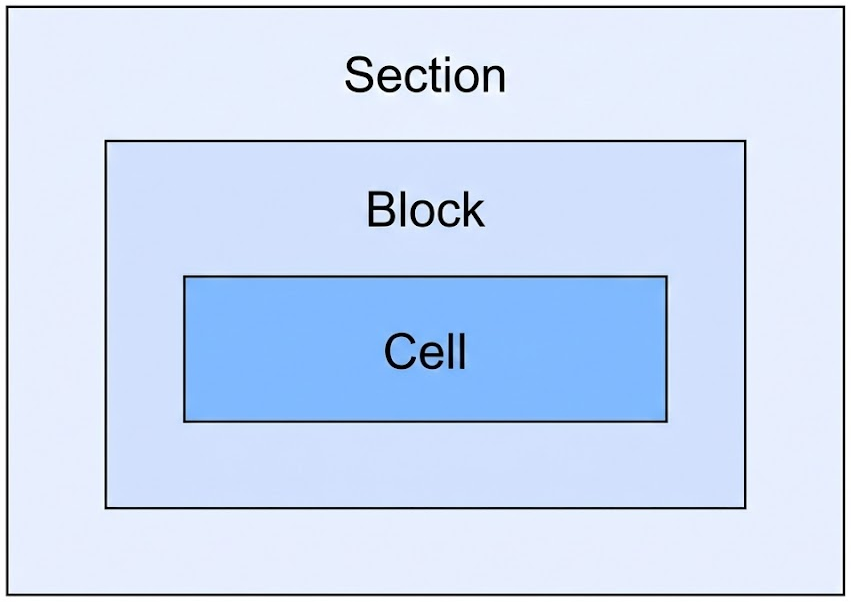
The page layout in KAIZEN is built on a strict parent-child relationship between three core layout components. When you create a new page, it contains a Natural Layout component initially, which provides a section, a block, and a cell.
-
Section: A section is the top-level container, designed to organise major, distinct parts of the page.
-
Purpose: It is used to group related content, such as a page header, a main content area, or a footer.
-
Layout: It always takes up the full width (100%) of the screen. You can create a new section by clicking Add Section.
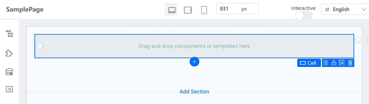
- Functionality: It provides a clear page structure, improves readability, and allows you to add or remove entire content areas.
-
-
Block: A block is a container that lives inside a section. It is used for managing content at a more detailed level.
-
Purpose: Blocks are the primary components for creating column-based layouts within a section.
-
Layout: They use a structured grid layout, and their width can be configured using the Col Span property. You can create a new block by clicking Add Block Below. You can split a block only vertically (into columns) by clicking the scissors icon.
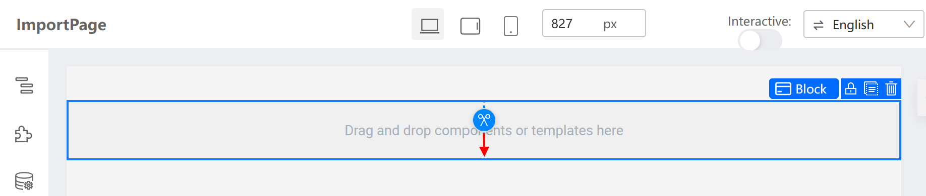
- Responsiveness: By default, blocks have a responsive wrap behaviour. On a smaller screen, like a mobile device, blocks in the same row will automatically stack vertically.
-
-
Cell: A cell is the smallest container in the hierarchy and lives inside a block.
-
Purpose: This is the final container where you place the actual UI components, such as text boxes, buttons, tables, and charts.
-
Layout: Cells use a flexible layout model. You can split a cell horizontally (into rows) or vertically (into columns) by clicking the scissors icon.

- Responsiveness: Unlike blocks, cells do not wrap by default. You have precise control over the arrangement of components on smaller screens.
-
Build a page layout
To build a page skeleton, use the following top-down approach:
-
Page types: While most of the work will be on a standard page, KAIZEN supports other page types for specific purposes in a Main and Micro Application architecture:
-
Action: For components that should persist globally across all pages, like a Logout button.
-
Menu Header, Banner, and Footer: For creating a consistent appearance across the application.
-
-
Page
-
Page creation and templates
Create new pages in the Resources panel. To accelerate development, start from a page template (e.g., a CRUD template). This provides a pre-built layout with basic functionality.
-
-
Layout
-
Start with the high-level structure
Get started by dividing sections, then adding blocks to the page. This defines the main rows or columns on the canvas.
For example, create a layout with a main content block and a sidebar block.
-
Sub-divide areas with cells
After completing the main blocks, create more complex layouts in them by selecting a cell inside a block and using the scissors icon to split the cell either horizontally or vertically.
Repeat the above process to create nested layouts like Row Containers and Column Containers.
-
Place UI components
After the skeleton of nested blocks and cells is complete, drag and drop the final UI components from the Components Library into the cells.
-
Last updated on 20 May 2026