Module 2. App Designer
In this module, you will explore the visual editing environment of KAIZEN. As a reminder, you are not building this application from scratch. Instead, you will inspect a fully realised, pre-populated reference application to see how easily branding, resources, responsive views, and rich UI components are configured.
2.1 Theme
Goal
Understand how global brand consistency is managed across your application without manual CSS coding.
Concept: Centralised Theme Design
Instead of styling every single page, form, and button individually, KAIZEN uses a centralised Theme Designer. This ensures that if your organisation's brand colours or component designs change, you can update them in one place and have those changes instantly cascade across the entire application ecosystem.
Inspection Tour
-
From the console home page, locate the left sidebar navigation menu and click the Theme Designer menu item.
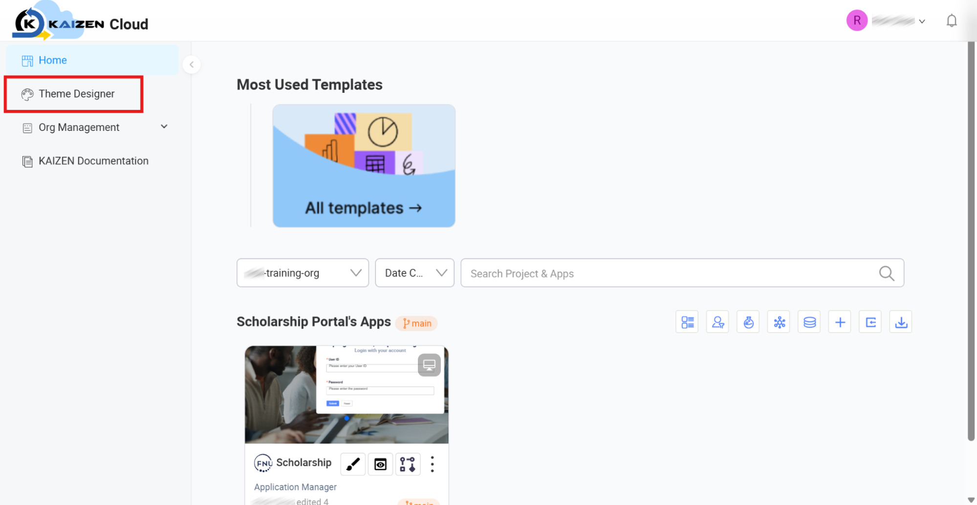
-
Once clicked, this will bring you to the Theme Designer home dashboard where all available design systems are listed.
-
Locate the standard pre-configured theme:
@tecq/default-blue. -
To inspect the theme, click the pencil/design icon located on the
@tecq/default-bluetheme card.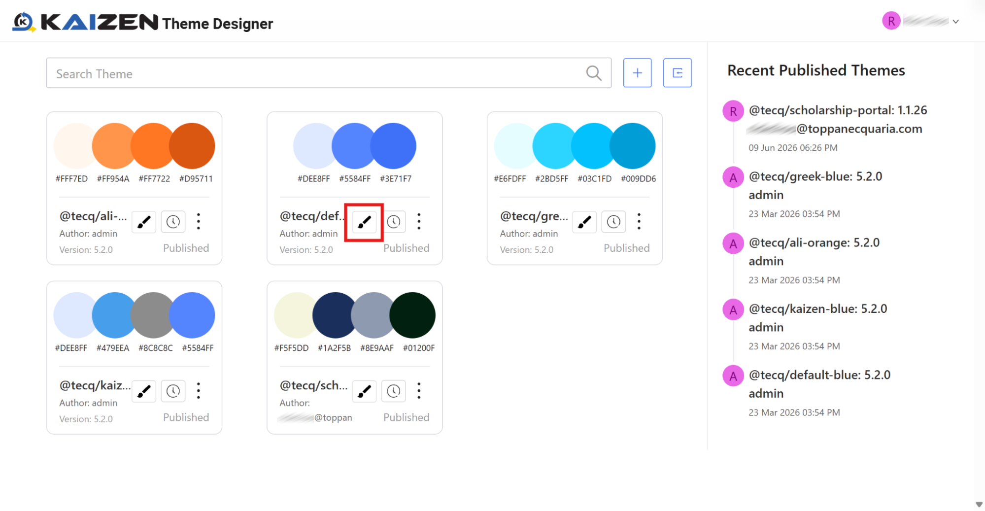
-
Once the design view loads, observe that all items that can be configured globally are organised in a clean list on the left panel.
-
Inspect Colour Schemes: Click Color under the "Global Style" category on the left panel. Here, you can view the exact brand colours, supporting tones, and data visualisation colours mapped out for your application.
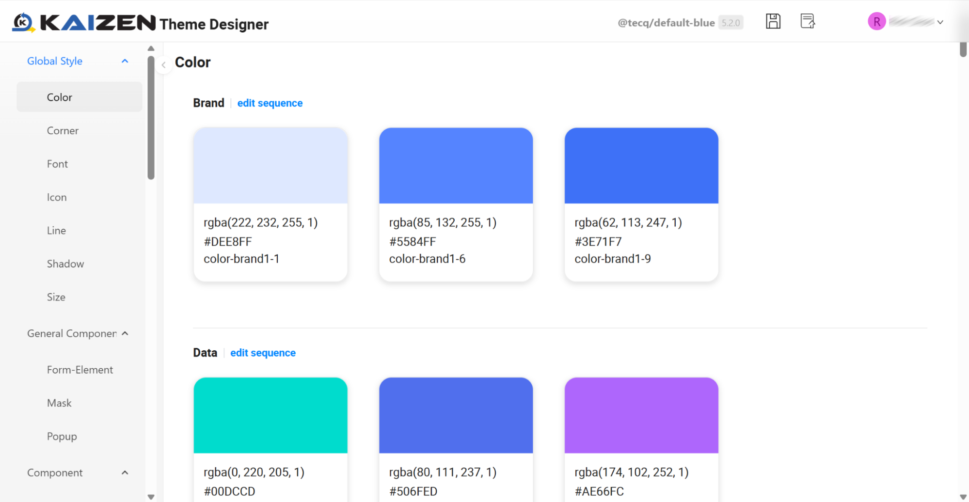
-
Inspect Component Styles (Buttons): Scroll down the left configuration list to the "Component" section and click Button. Here, you can explore how different states (Normal, Hover, Active, Disabled) and sizes (Large, Medium, Small) are visually customised for buttons globally.
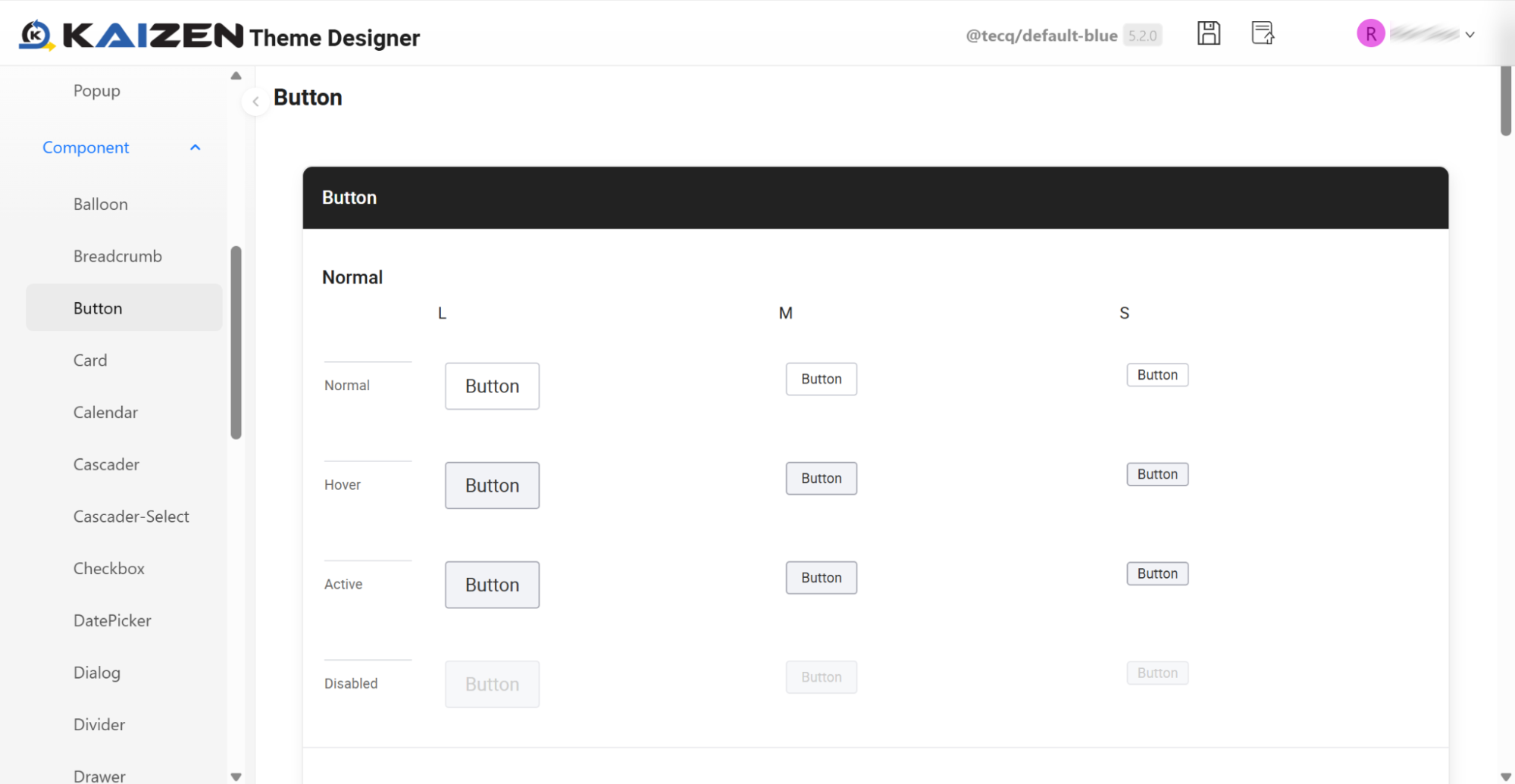
2.2 Accessing the App Designer & Live Theme Swapping
Goal
Transition from the global theme settings into the application's visual designer, and verify how live theme switching dynamically alters UI components instantly on the Canvas.
Concept: Consolidated Workspace & Dynamic Styling
Now that you have seen how brand themes are managed centrally, let's step into the creator environment of the application itself. The App Designer consolidates all your visual assets, layout grids, and interactive screens into a single visual window.
Before diving into the page structures, we can test KAIZEN's theme engine live on the Canvas. By swapping themes directly inside the designer utility panel, the visual style of all components instantly shifts, showing how the UI adapts to different brand configurations.
Inspection Tour
-
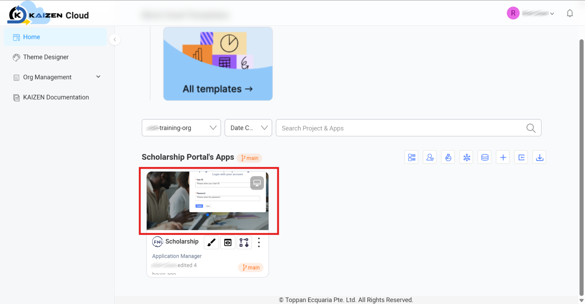
Launch the App Designer: Navigate back to the Console Home Page. Locate the pre-built application named Scholarship.
-
Access the designer either by clicking directly on the Scholarship card or by clicking the Design (pencil) button on the application card.
-
Open the Inline Theme Panel: Once the App Designer loads the
LoginPageon the Canvas, look to the vertical utility bar on the far left side. Click the Theme icon. This opens the theme selector panel next to your workspace.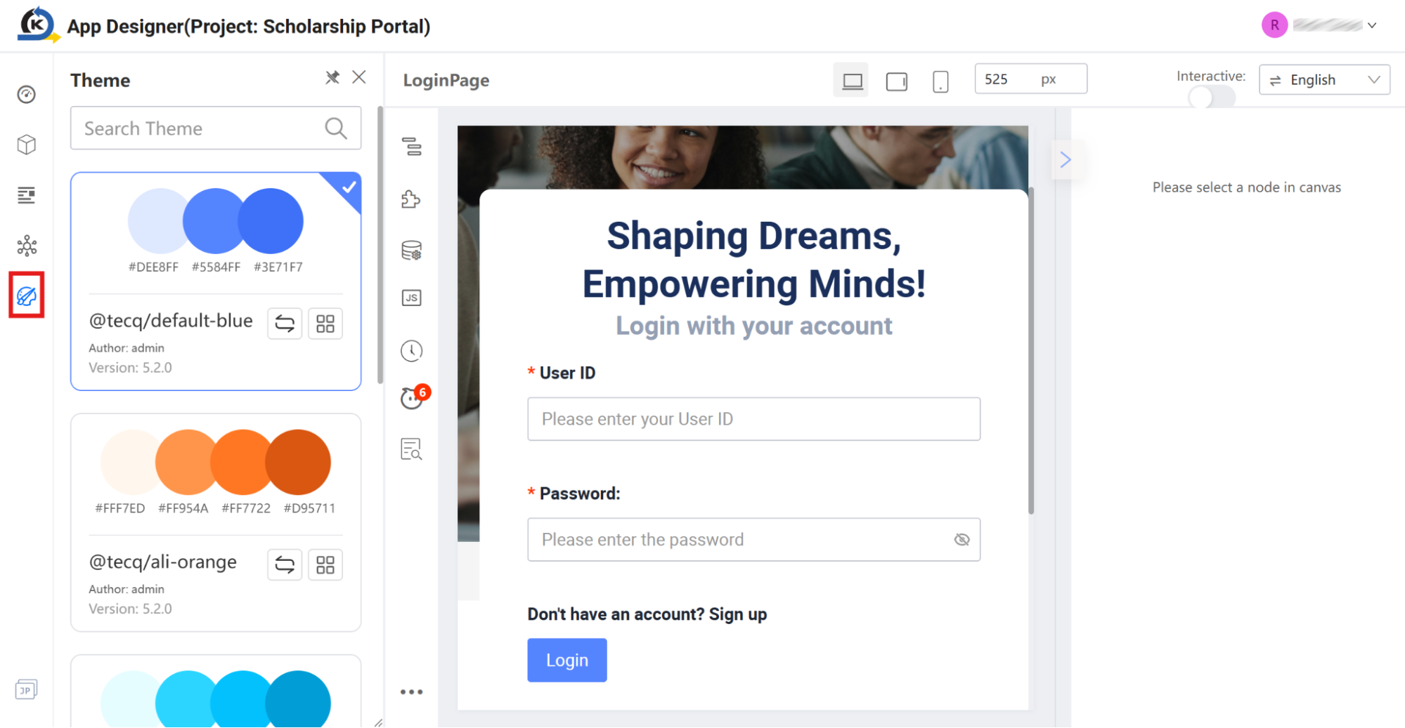
-
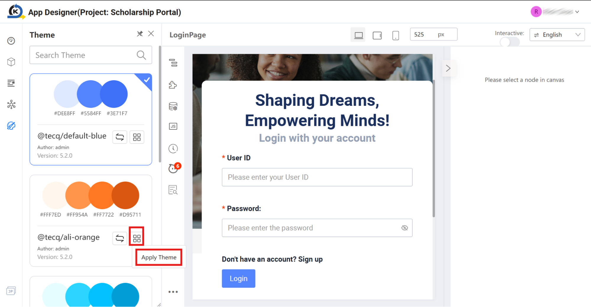
Select a New Theme: Locate the
@tecq/ali-orangetheme card in the Theme list. Hover over the theme card and click the four-square grid (Apply Theme) icon. -
Apply the Theme: Click the Apply Theme action menu item that appears.
-
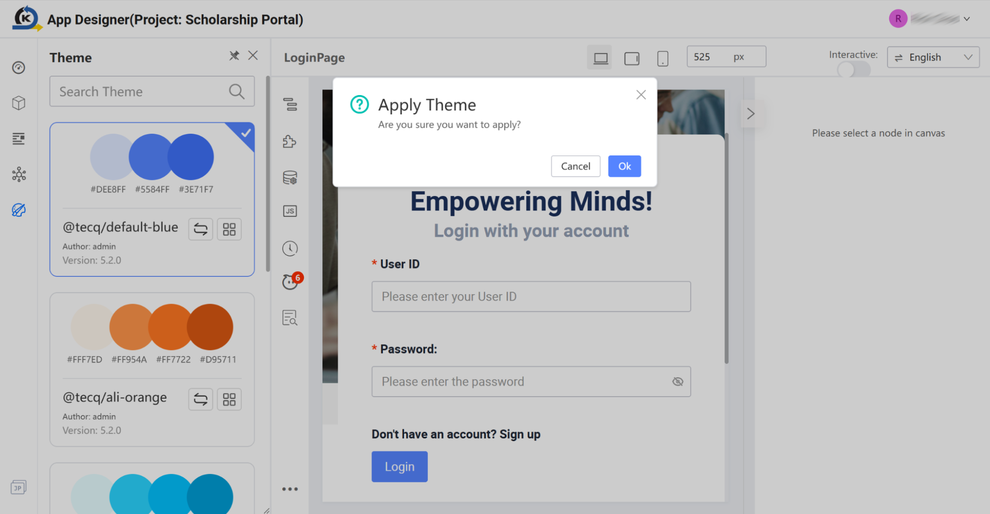
Confirm Selection: On the confirmation modal that pops up asking "Are you sure you want to apply?", click OK.
-
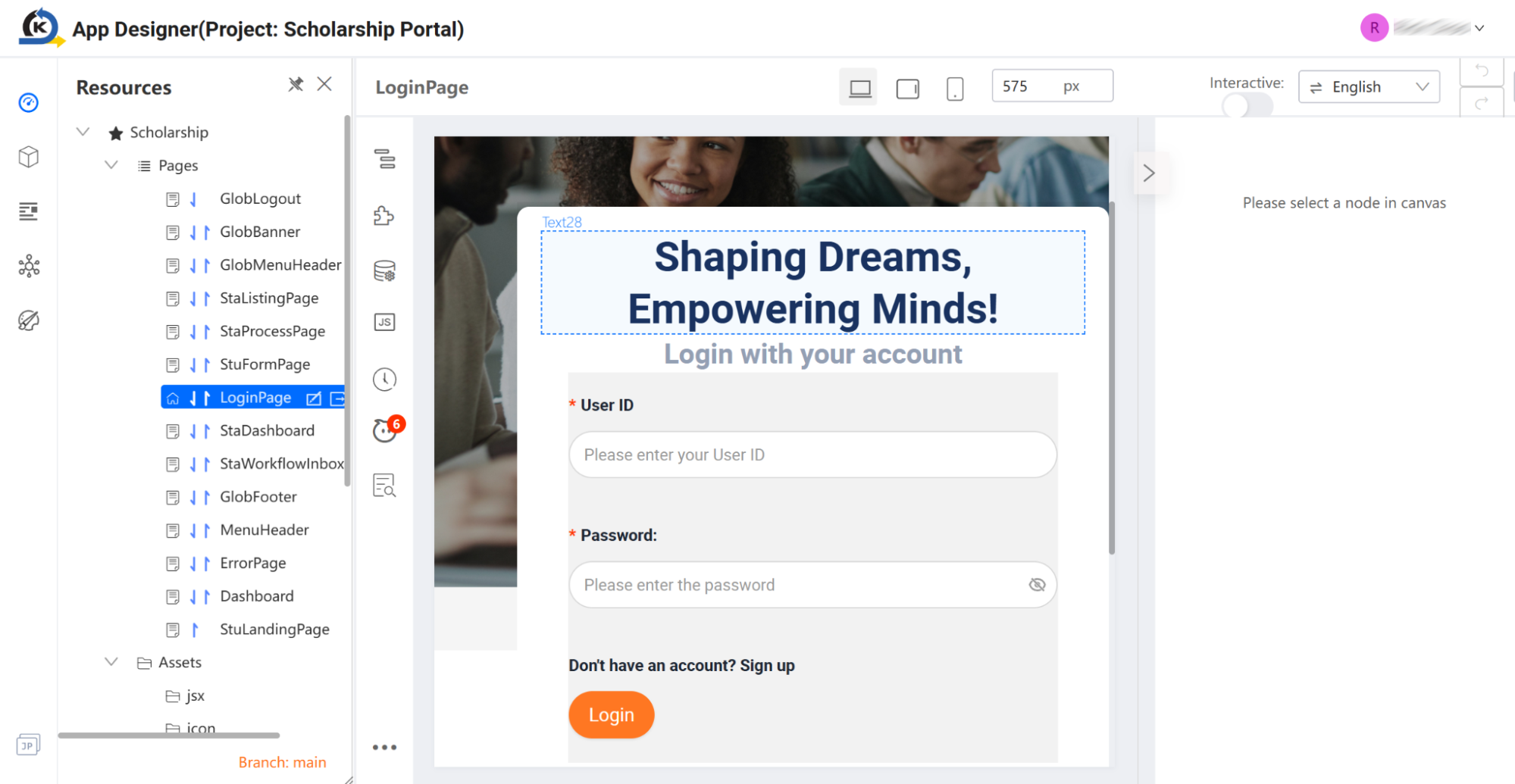
Verify the Change: Look at the visual Canvas. Refresh the page and notice how the "Login" button has transformed from the default blue brand colour to the new vibrant orange brand styling without requiring a single line of CSS modification.
2.3 Resources Directory
Goal
Explore how UI screens and supporting assets are structured in your project directory.
Concept: Consolidated Resources
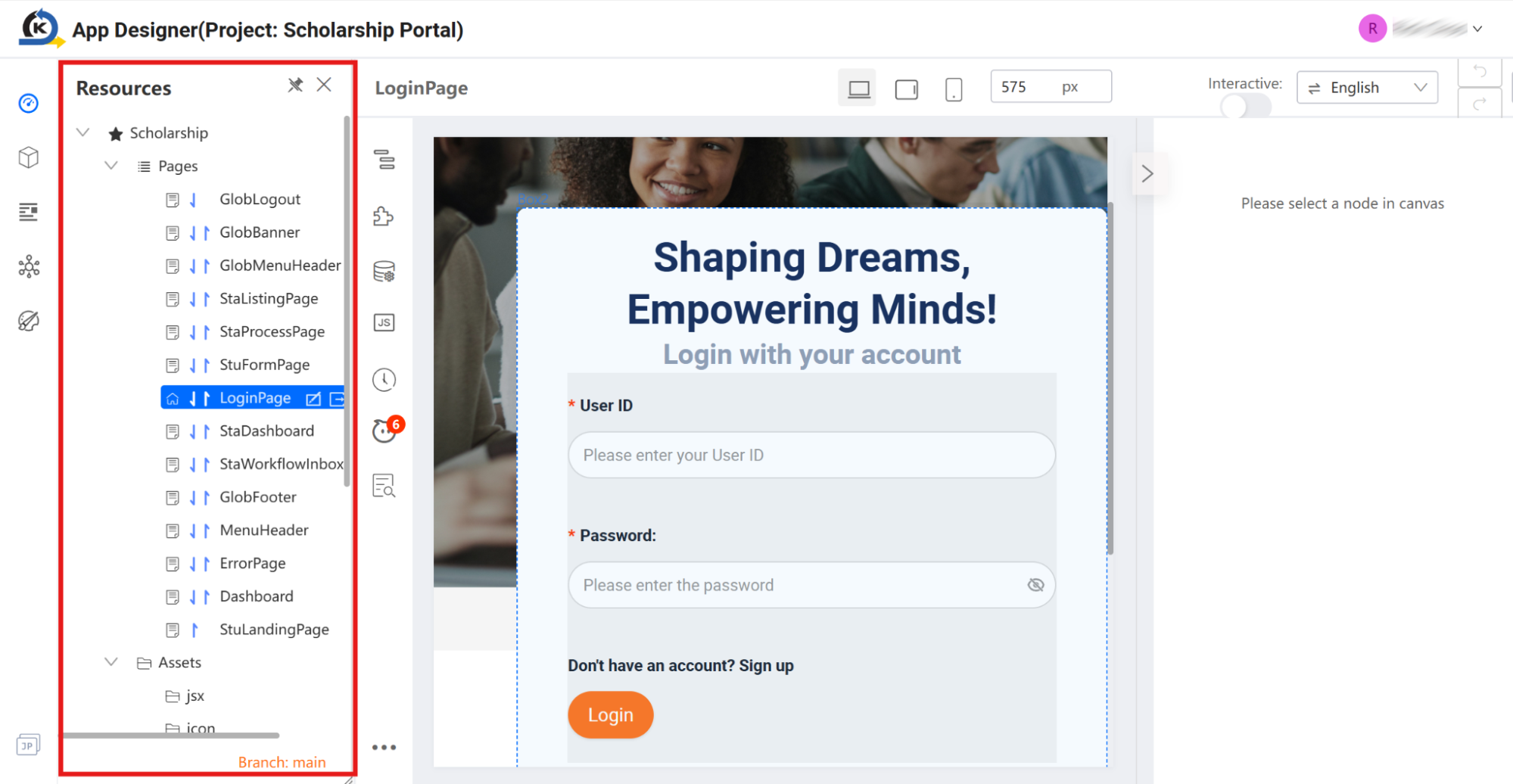
On the left side of the App Designer workspace sits the Resources panel. This panel organises the structural building blocks of your user interface into two clean categories:
- Pages: The actual web screens making up your user's experience.
- Assets: The supporting media library (such as your organisation's brand logos, structural graphics, and styling definitions).
Inspection Tour
-
Locate the Resources Directory: Look immediately to the left-side Resources panel.
-
Expand the Pages folder. Take a look at the ready-to-use screens pre-configured for this scholarship application, such as
LoginPage,StaDashboard, andStuFormPage. -
Expand the Assets folder, then expand the
imagesubfolder. Notice how supporting images likefnu_logo.pngand custom background assets are stored neatly inside the project repository. -
Select the Workspace Page: Click
StuFormPagewithin the Pages list on the left menu. This will open the primary scholarship intake form on the central Canvas so we can continue with our tour.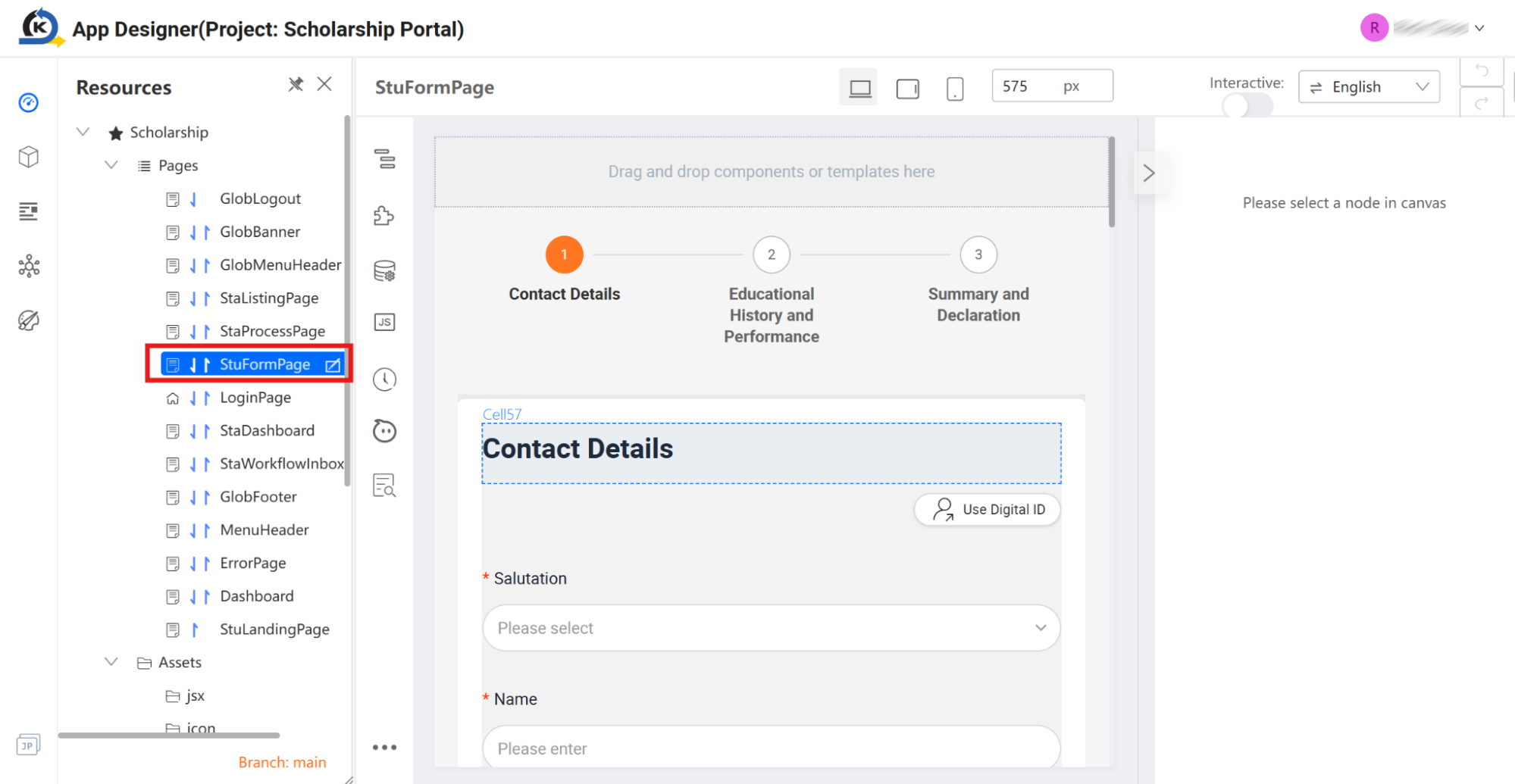
2.4 Canvas
Goal
Navigate the responsive workspace and understand how KAIZEN visualises design across different devices.
Concept: "What-You-See-Is-What-You-Get" (WYSIWYG) Fluidity
The Canvas is your live interactive design arena. It operates on a What-You-See-Is-What-You-Get (WYSIWYG) philosophy, meaning it shows you exactly how your application will render to an end-user in real-time. Instead of forcing you to write complex CSS media queries, KAIZEN's built-in responsive frames show you how elements automatically scale and adapt to different browser heights and widths.
Inspection Tour
-
Ensure you have
StuFormPageloaded on your central Canvas.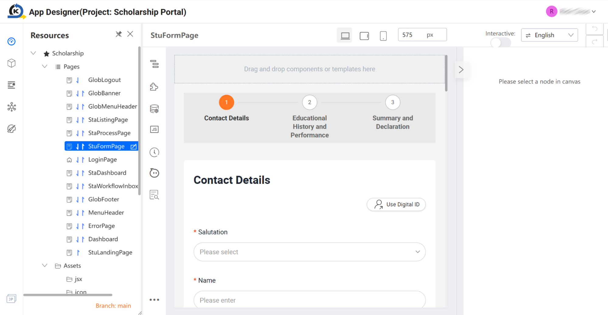
-
Look at the Viewport Switcher located in the middle of the Top Action Bar.
-
Click the Mobile viewport preset. Notice how the visual application layout fluidly shifts, stacking form layout columns and condensing inputs to guarantee mobile readiness.
-
Click the Tablet viewport preset to verify middle-tier scaling, then switch back to the default PC (Desktop) view.
-
This visual validation ensures that business users can comfortably design or review application screens without worrying about technical browser compatibility.
2.5 Drag and Drop Components
Goal
Review the comprehensive library of ready-to-use visual components that speed up application delivery.
Concept: High-Fidelity Widgets
KAIZEN eliminates the need to build standard form inputs, visual layouts, and complex data representations from scratch. Instead, the platform offers a rich library of pre-packaged components that are fully responsive and visually configurable.
Inspection Tour
-
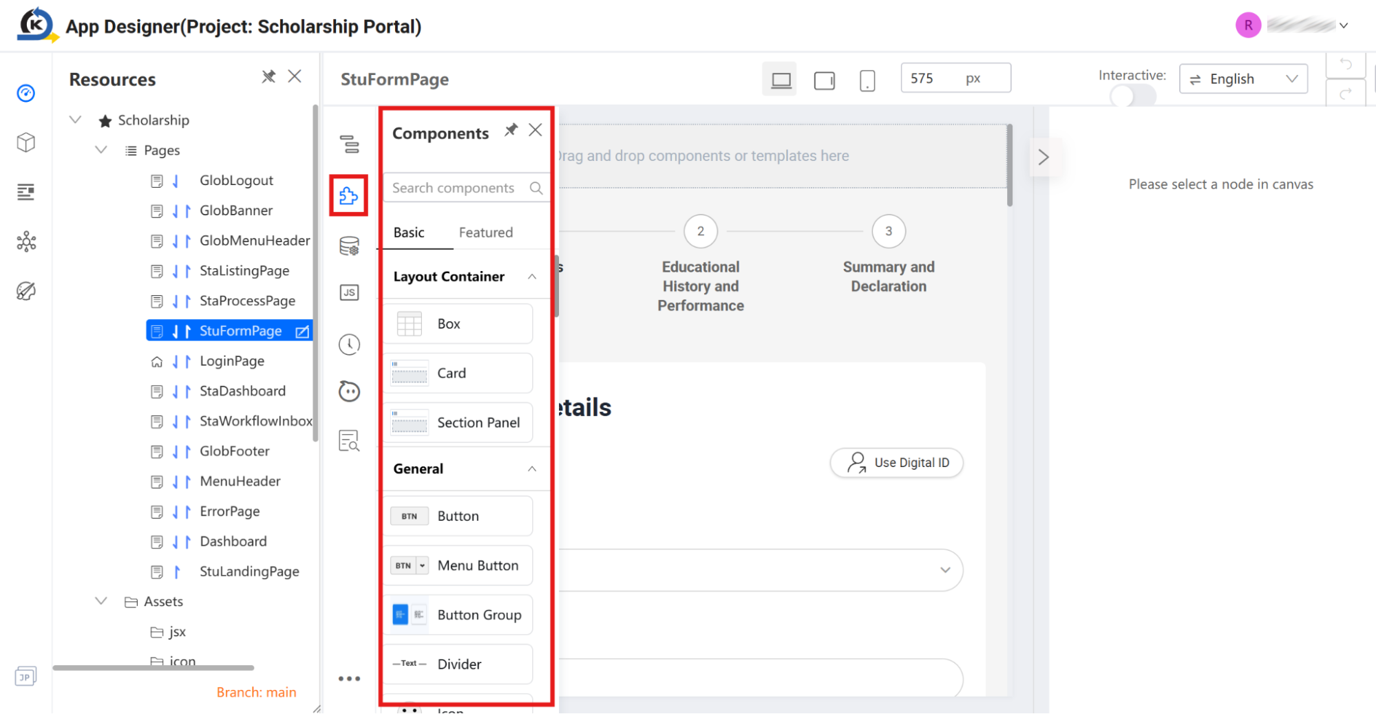
Locate the Component Library icon tab (the blocks icon) on the left vertical utility bar, directly below the Resources folder icon.
-
Click to open the Components menu. Note that components are split into two primary view options: Basic and Featured.
-
Under the Basic tab, inspect how components are organised into logical business categories to speed up visual assembly:
-
Layout Containers & General Elements: View the structural layout cards, boxes, section panels, custom buttons, icons, links, and navigation breadcrumbs.
-
Information Input: Scroll down to find pre-built data collection elements such as Checkbox, Checkbox Group, DatePicker, RangePicker, Cascader, Submit/Reset Buttons, and direct custom HTML slots.
-
Information Display: Scroll further down to inspect media and feedback elements such as Audio, Video, Avatar, Badge, Tag, Calendar, Carousel, Timeline, and hierarchical Tree views.
-
-
Look closely at the
StuFormPageloaded on your central Canvas. Point and hover over different areas of this completed form to identify the widgets already in play:-
Note the Dropdown selection box for the "Salutation" field.
-
Look at the standard Input Text fields used to gather personal information like "Name", "NRIC", and "Email".
-
Observe the integrated Contact Number widget pre-loaded with global country flag selectors.
-
-
By having these high-fidelity widgets out of the box, teams can focus their energy on perfecting user experience and operational flow, instead of spending weeks building foundational form elements.
2.6 Navigating with the Component Tree
Goal
Learn how to inspect deeply nested layout sections and form groups using the application visual hierarchy.
Concept: Structured Navigation
When design pages grow complex, clicking directly on nested items inside the central Canvas can sometimes be imprecise. KAIZEN provides a Component Tree panel that renders a clean, hierarchical blueprint of every layout box, grid column, form template, and button. This allows developers to immediately pinpoint and select exact component blocks without design-view guessing games.
Inspection Tour
-
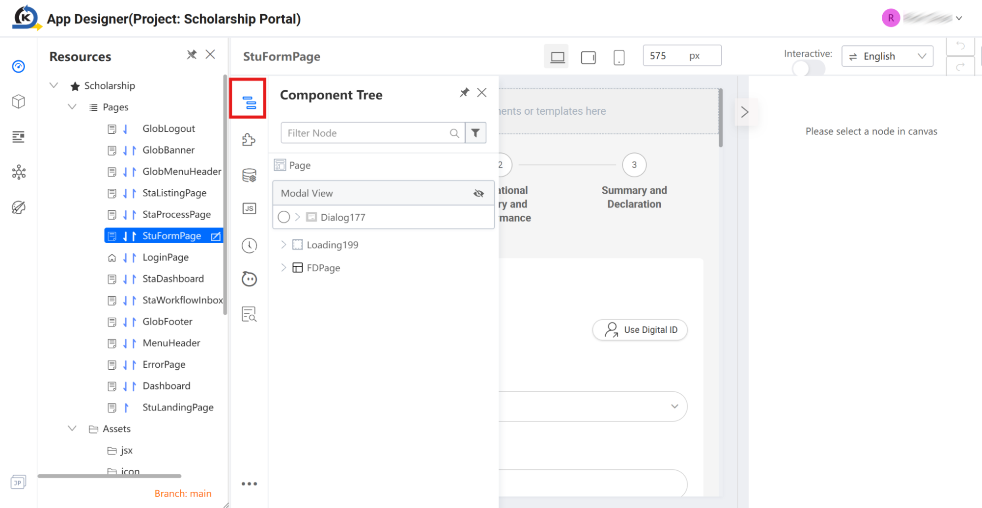
Locate the Component Tree icon (the hierarchy node/flow icon) on the left vertical utility bar, situated directly above the Component Library icon.
-
Click the icon to launch the Component Tree sidebar.
-
In the tree navigation view, look down through the page hierarchy and locate the item labelled
Form-ContactDetailunder the primary layout structure.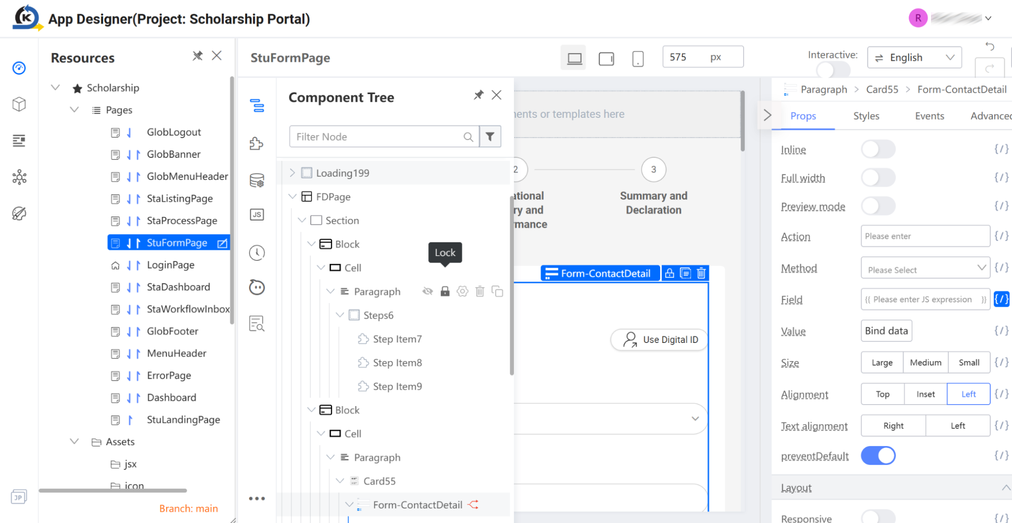
-
Click
Form-ContactDetail. -
Notice how the active selection bounding box on the central Canvas instantly locks onto the main contact information Form Template block, and the properties inspector on the right updates to display its associated settings (Props, Styles, Events, Advanced).
2.7 Form Data Binding & Client-Side Scripting
Goal
Inspect how visual form items are dynamically bound to logical backend variables and manipulated using client-side JavaScript.
Concept: Dynamic State Variables & The Next.Field API
KAIZEN simplifies form handling by avoiding complex programmatic state-management boilerplate. Instead of tracking the state of each form input individually, an entire form visual block can be bound to a single helper variable: this.formField.
Through KAIZEN's built-in Next.Field JavaScript API library, developers can retrieve or update the entire form's dataset dynamically using simple, readable commands (like setValue and getValues) targeted at specific field identifiers.
Inspection Tour
-
Inspect Individual Form Items: In the Component Tree, expand the nested nodes under
Form-ContactDetail. Locate and click the node labelledForm.Item61(which wraps the "Salutation" field). Observe how the right side panel updates to show specific properties configured for this individual form element.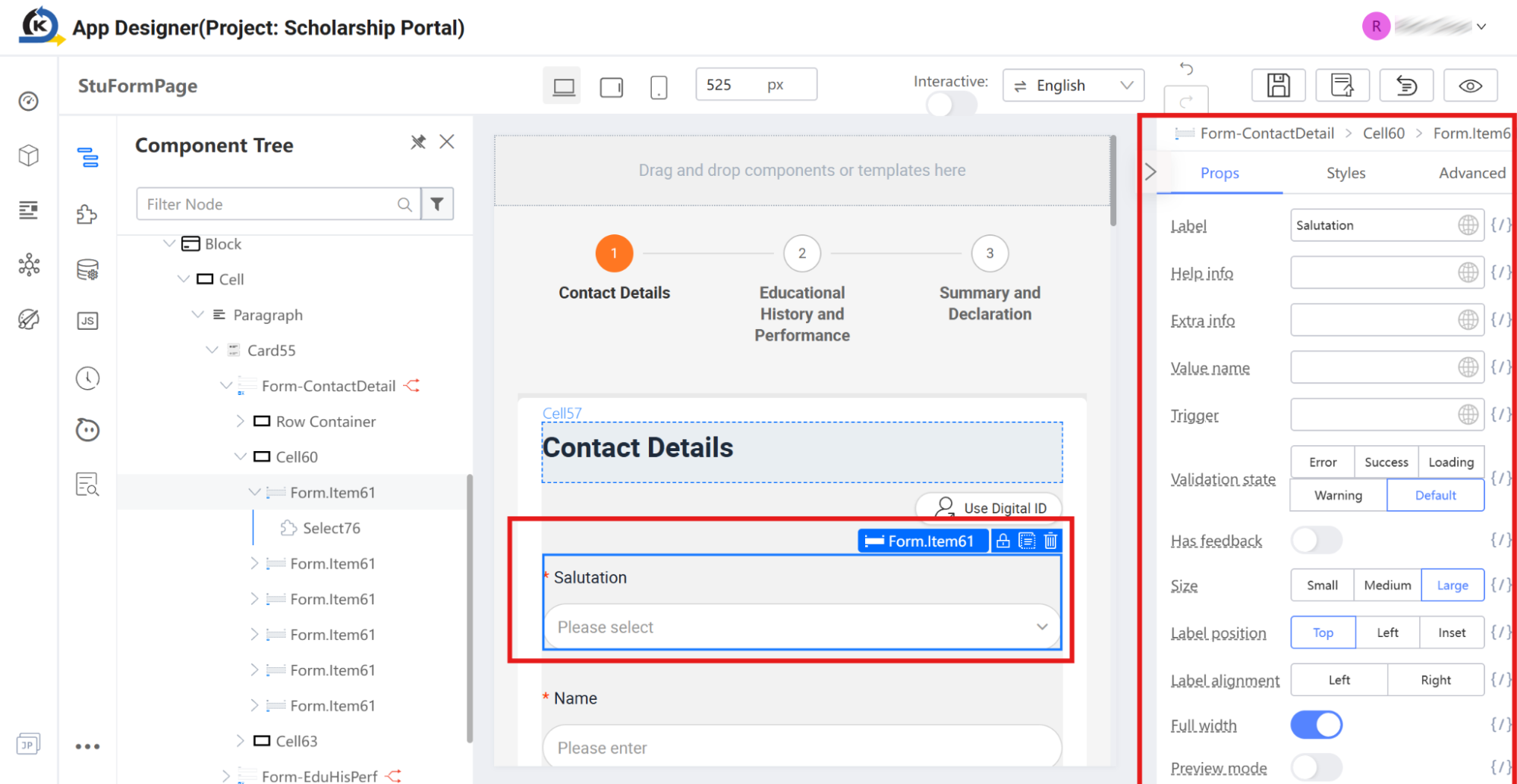
-
Select the Parent Form Template: To see how the entire card of input fields is bound globally, click the parent template container
Form-ContactDetailin your Component Tree.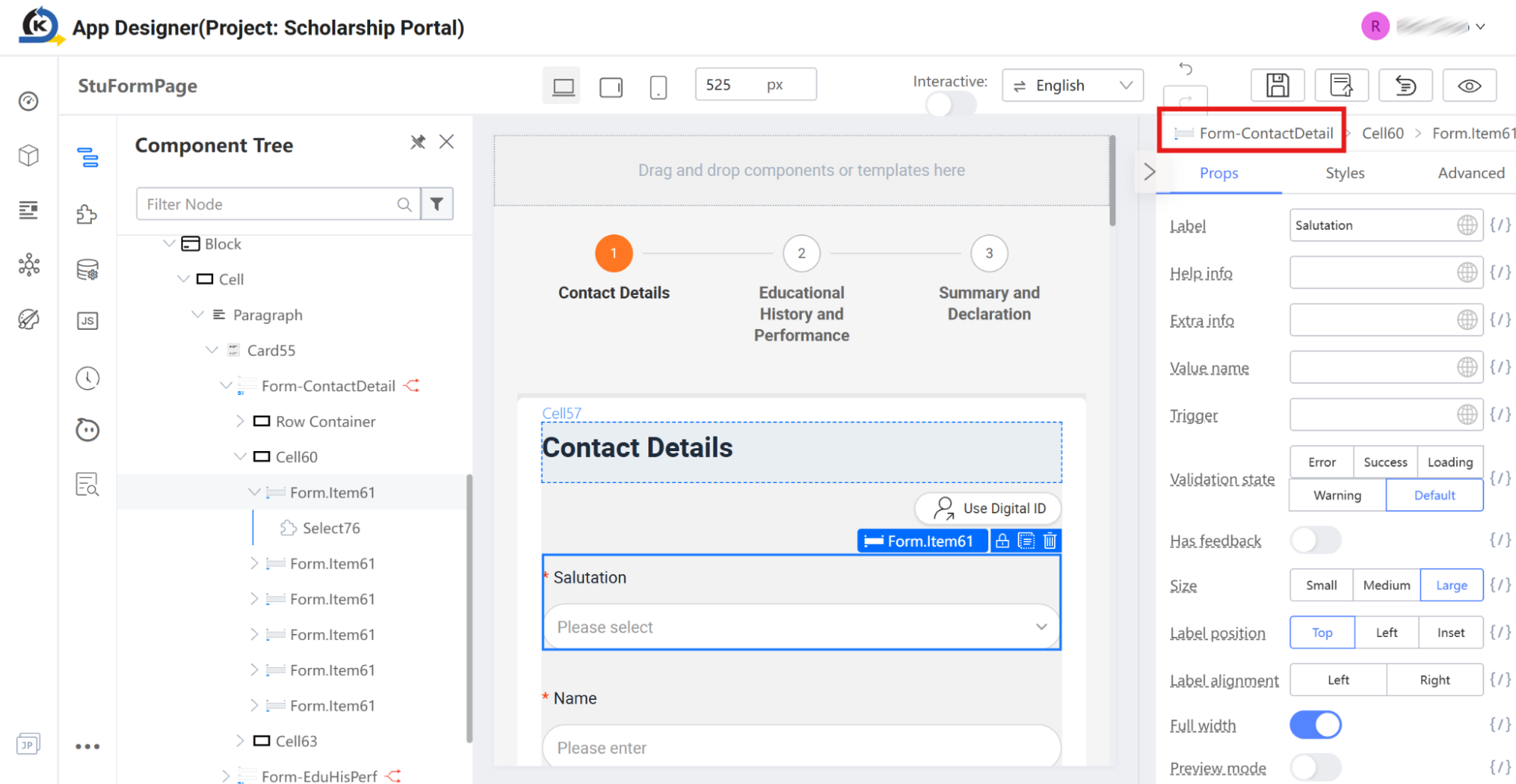
-
Verify Variable Binding: Look to the Props tab in the properties inspector on the right side. Locate the Field property. Notice that it is visually mapped to
{}, indicating an active variable link. Click the bracket icon next to the Field input box to inspect the configuration.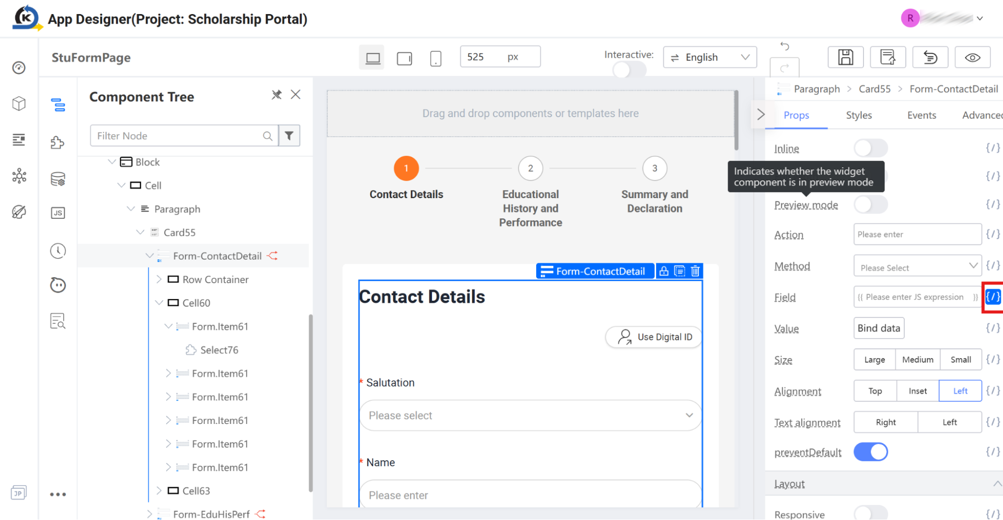
-
Check the Variable Contract: In the popup modal that loads, verify that this structural form has been successfully bound to the state variable:
this.formField.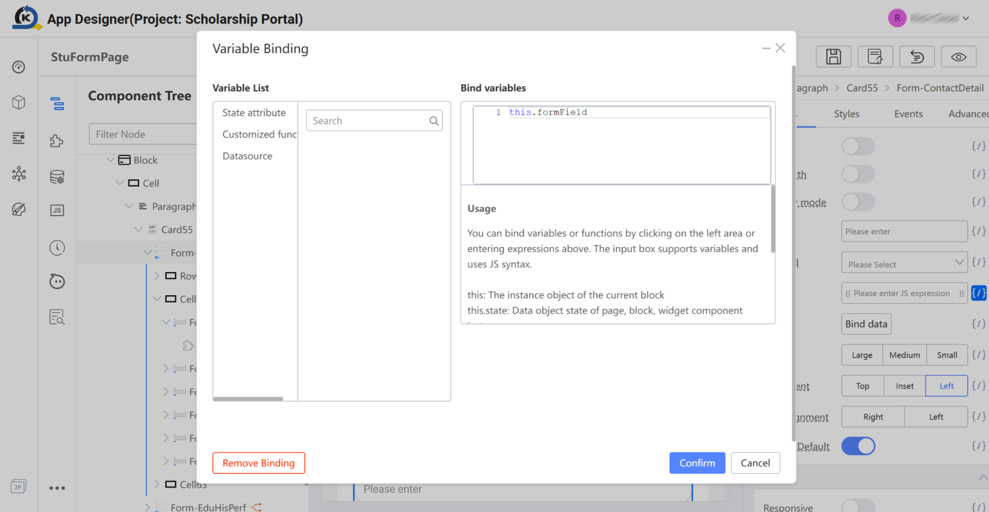
Click the Confirm button to close the modal.
-
Open the Source Code Panel: To see how this state variable is defined and utilised in code, locate the vertical utility bar on the left side and click the Source Code Panel icon.
-
Inspect the Constructor Initialisation: In the JavaScript editor that slides out, look inside the standard constructor function around line 19:
this.formField = new Next.Field(this);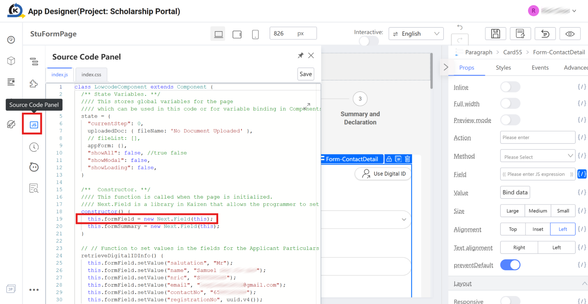
This simple line of code instantiates a new KAIZEN dynamic form utility instance, automatically tracking and syncing all inputs located inside the bound
Form-ContactDetailvisual structure. -
Find the Form Item Identity: To understand how code maps to a specific input, close the Code Panel and click the Salutation form item (
Form.Item61) in the Component Tree. Look at the properties inspector on the far right, and scroll down to the Advanced section. Look at the Name property field. Notice that its programmatic key is defined as:salutation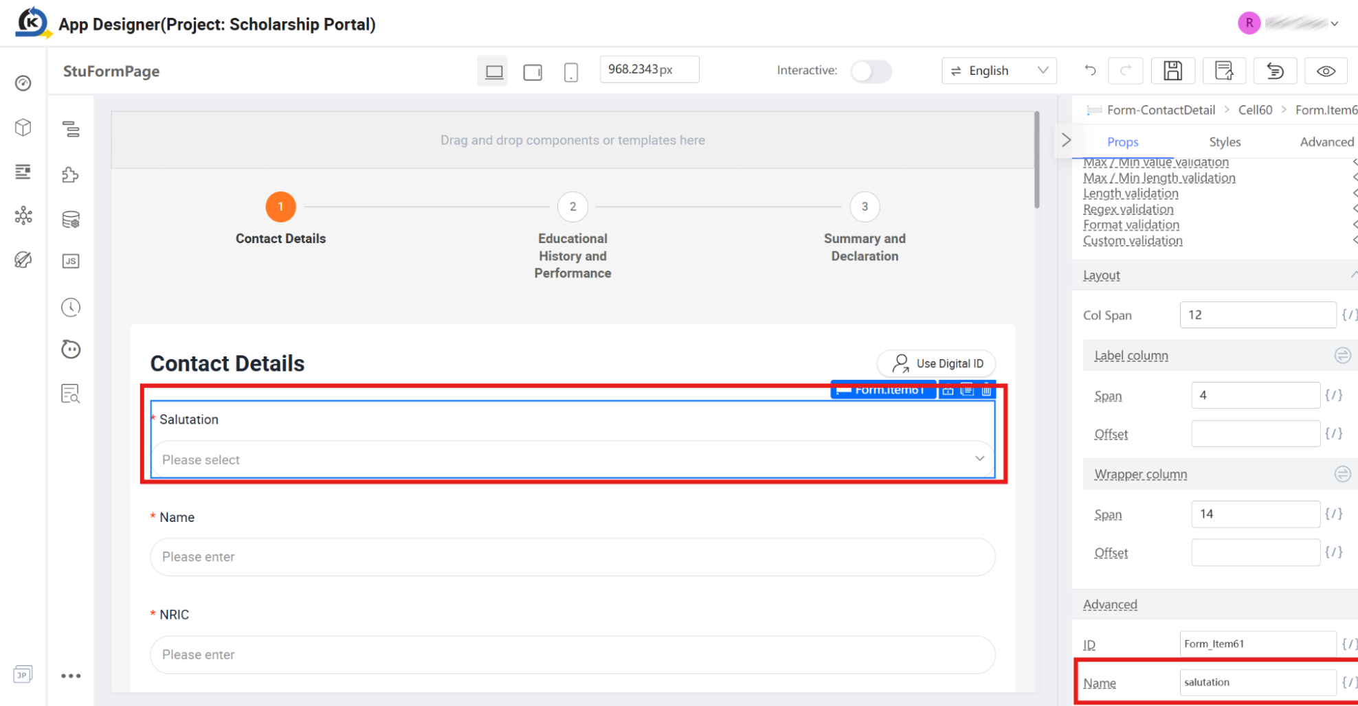
-
Analyse Code Manipulation: Open the Source Code Panel. Now inspect how developers use this defined name key in code to get or set form values programmatically (such as inside the
retrieveDigitalIDInfo()function):-
Set Values Dynamically: We can populate form values with a single method call:
this.formField.setValue("salutation", "Mr");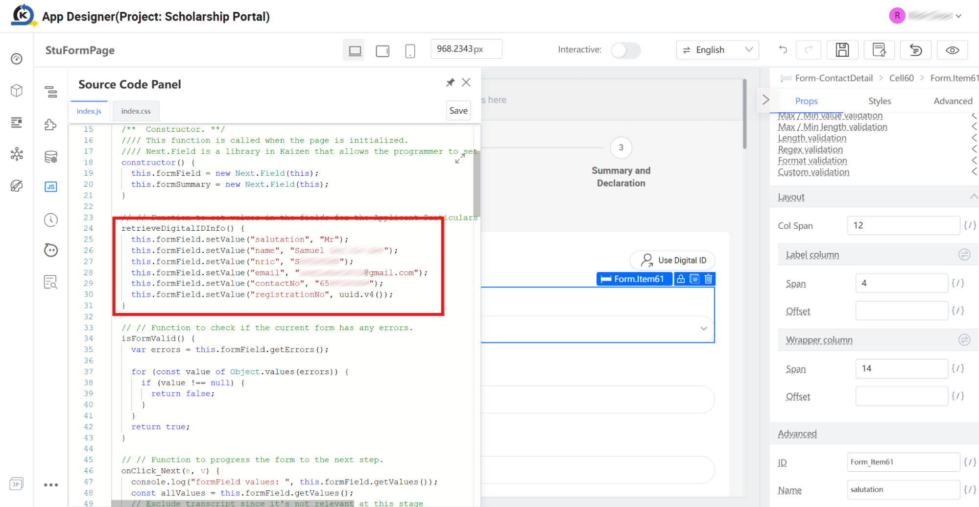
-
Get Values Dynamically: We can retrieve all nested input data as a clean JSON object at any time:
this.formField.getValues();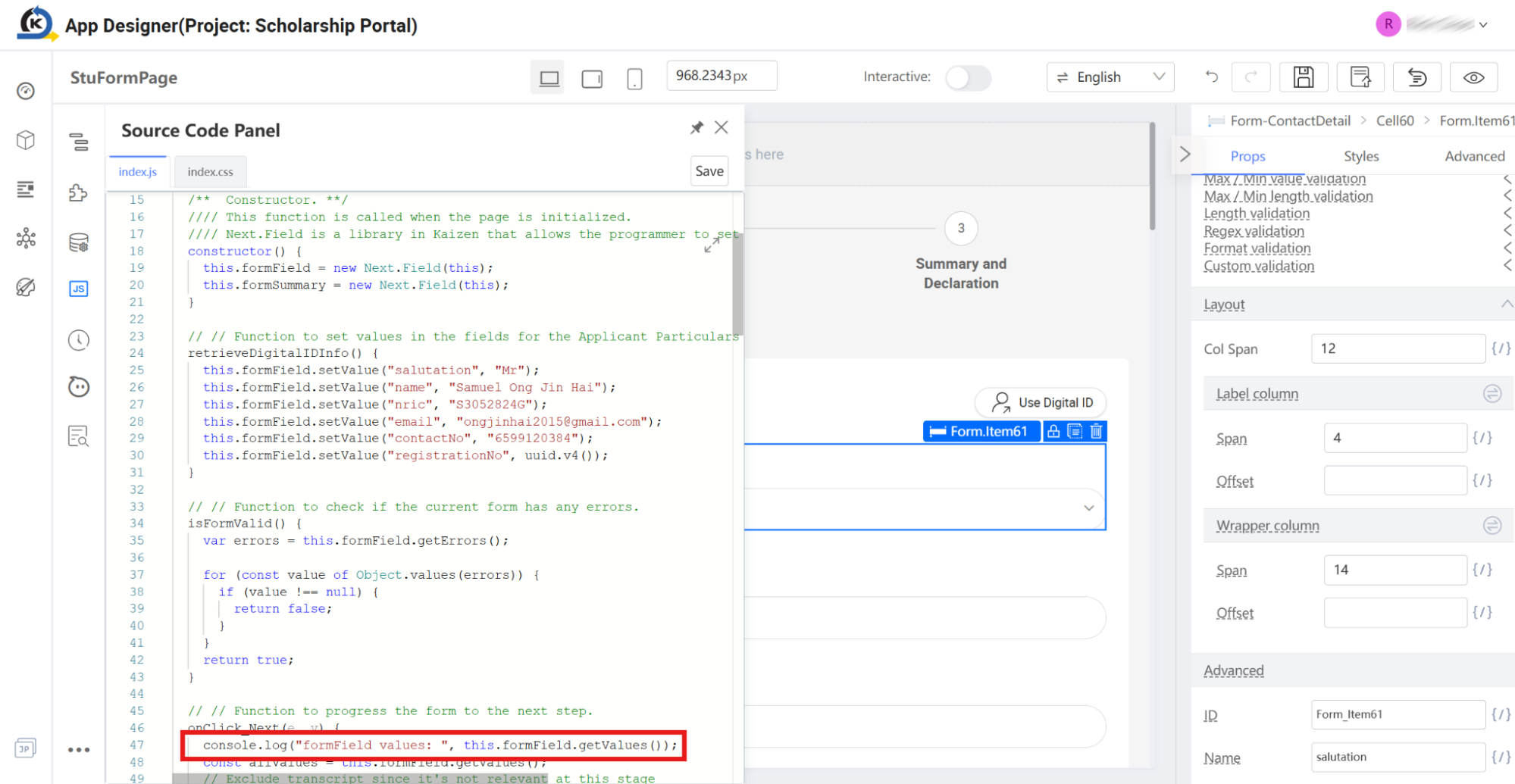
The bridge between visual layouts and readable JavaScript APIs gives developers the coding flexibility without manual DOM manipulation.
-
2.8 Button Event Binding
Goal
Inspect how user actions are wired to logical browser events and locate their corresponding client-side JavaScript execution code.
Concept: Visual Event Handlers
In traditional web development, capturing a button click and triggering logic requires developers to manually query the DOM element and attach an event listener. KAIZEN simplifies this process via the Events tab. Any component can visually expose its native browser hooks (like clicks, mouse hovers, or focus states) and tie them directly to programmatic functions configured within the application's runtime context.
Inspection Tour
-
Locate the Next Button: Look at the bottom of the contact form inside the central Canvas or expand the hierarchy tree to locate the Next button component, programmatically registered as
Form.Submit65. Select it.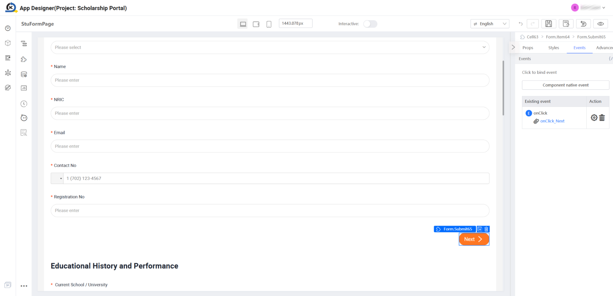
-
Access the Events Panel: Look to the properties inspector on the right side and click the Events tab.
-
Inspect Native Hooks: Click the Component native event button. A dropdown popover appears listing the possible interaction events you can capture. Observe that the
onClickevent is greyed out. KAIZEN grays out active hooks to prevent accidental duplication, indicating this button is already configured to respond to click triggers.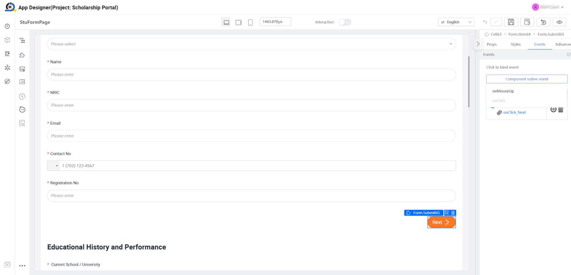
-
View Existing Bindings: Look at the Existing event table directly below the native action button. Notice that
onClickis configured and mapped to a custom function. -
Verify the Binding Configuration: Click the gear icon (Action/Settings) next to the
onClickrow. This pops open the Event Binding manager modal. Observe that this visual click trigger is tied directly to the page's logical helper function:onClick_Next.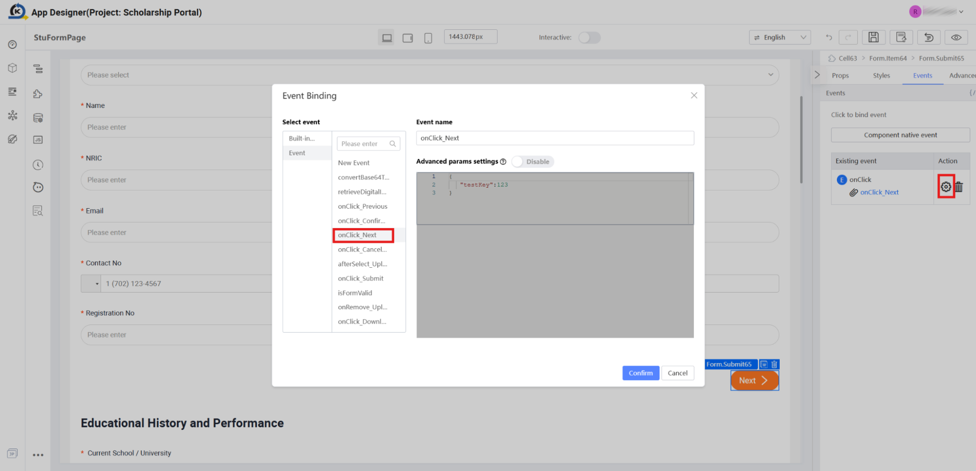
Click the Cancel button to close the modal.
-
Navigate Instantly to Source Code: To see what happens programmatically when an end-user presses this button, click directly on the underlined link labelled
onClick_Nextinside the existing event list.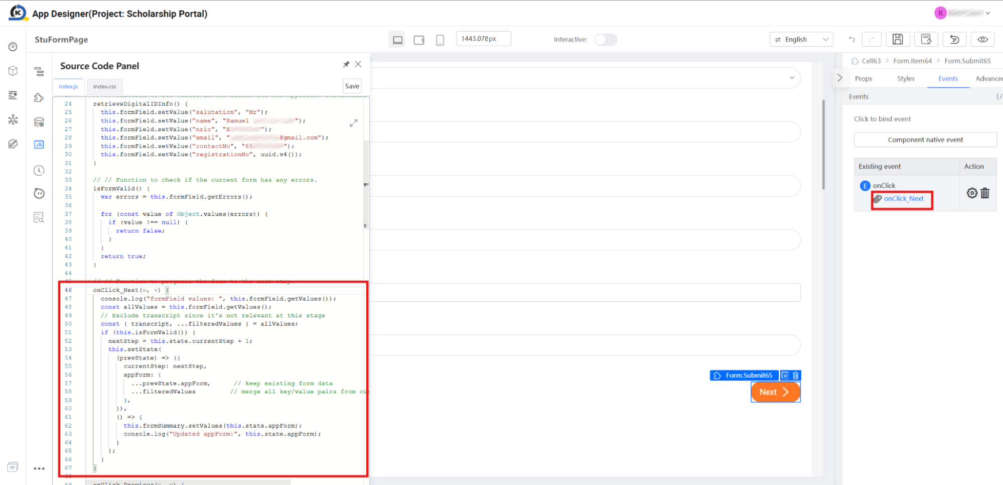
-
Trace the Functional Execution: Notice how KAIZEN instantly slides open the Source Code Panel and automatically highlights the exact line of JavaScript defining the
onClick_Next(e, v)function (as shown on line 46 in the image above):onClick_Next(e, v) {console.log("formField values: ", this.formField.getValues());const allValues = this.formField.getValues();// ...if (this.isFormValid()) {nextStep = this.state.currentStep + 1;this.setState({currentStep: nextStep,// ...});}}
This seamless traceability allows developers to inspect, review, or debug frontend logic instantly without searching through endless, fragmented script folders.
2.9 Interactive Modals & Reactive State Binding
Goal
Examine how popup elements are managed dynamically in KAIZEN using reactive state variables instead of manual browser DOM selectors.
Concept: State-Driven Overlays
In legacy web applications, launching and hiding popup modal overlays required custom JavaScript handlers to find element classes or IDs and toggle visibility style rules directly. KAIZEN uses modern State-Driven UI patterns.
An element like a Dialog window remains bound to a simple background boolean state variable (e.g., this.state.showModal). When any button click or validation logic toggles that state to true, the UI instantly reacts, fluidly showing the popup modal.
Inspection Tour
-
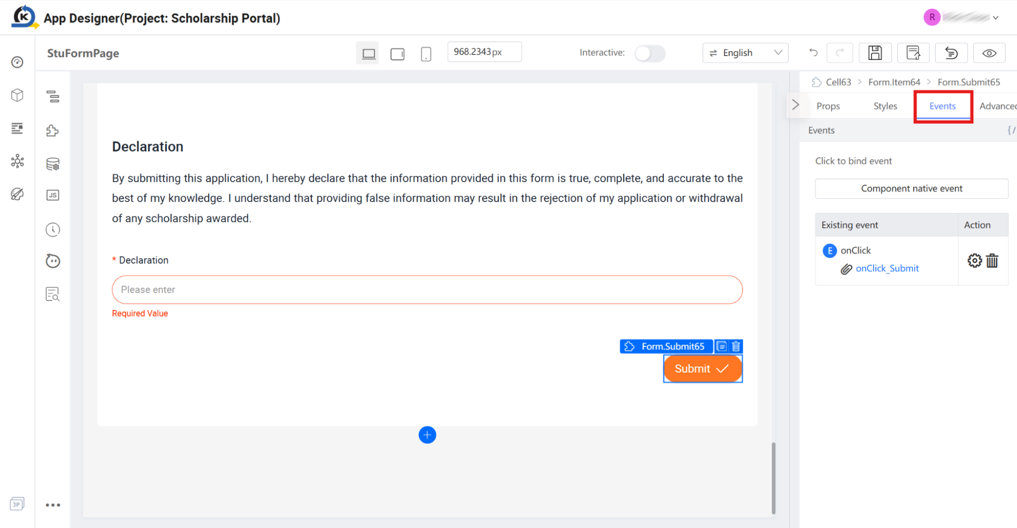
Find the Submit Button: Scroll down toward the very bottom of the intake form. Locate and select the Submit button.
-
Trace the Action Handler: Switch to the Events tab in the right properties inspector. Note that the button's
onClickevent is visually mapped to a function named:onClick_Submit. -
Inspect the Implementation Code: Click directly on the underlined
onClick_Submitevent link. This opens the Source Code Panel and highlights the function logic around line 155 in the image below: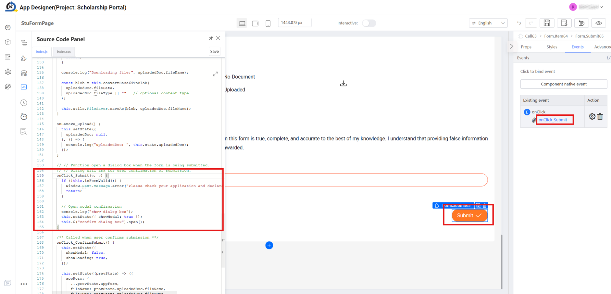
-
Identify the State Change: Read the highlighted logic. After performing field validations, the script executes a simple state update to transition the page view:
this.setState({ showModal: true }); -
Open the Modal View in the Hierarchy: Close the code panel. Look to your Component Tree panel on the left side. Notice a special top-level section named Modal View. Under this category, select the node labelled
Dialog177.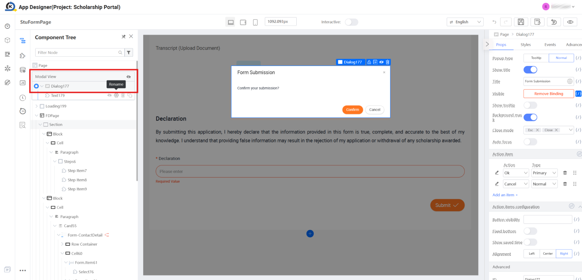
-
Interact with the Visual Modal: Once selected, notice that the visual Canvas instantly renders the active, translucent overlay containing the "Form Submission" dialog box.
-
Verify the Visibility Binding: Look at the properties inspector on the far right under the Props tab. Locate the Visible property. Notice that instead of displaying a static text true/false toggle, it is actively marked with the reactive variable badge:
Binded: this.state.showModal.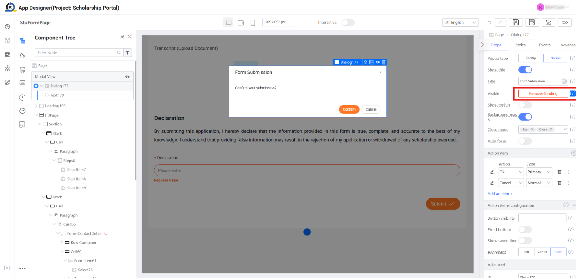
-
Check the Variable Contract: Click the bracket icon next to the Visible parameter. Under the popover modal that loads, observe that the modal is bound directly to:
this.state.showModal.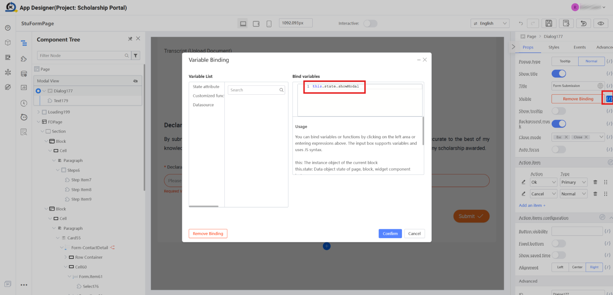
Click the Confirm button to exit.
-
This binding proves how cleanly visual objects and modern framework state models run together in KAIZEN. Toggling state triggers immediate, visual updates to any connected element automatically.
2.10 Modal Action Items & UI Event Handlers
Goal
Explore how modal buttons are configured visually, and trace how confirming the modal maps to runtime scripts.
Concept: Consolidated Action Framework
KAIZEN separates dialog boxes into visual shells and customizable functional buttons called Action Items. Developers do not need to construct individual nested button components inside a popup template. Instead, they specify action keys (like "Ok" or "Cancel"), customise their labels (like changing "Ok" to "Confirm"), and bind click event triggers directly to runtime page controllers.
Inspection Tour
-
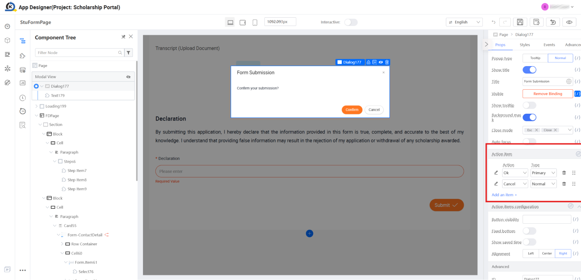
Locate the Modal Action Settings: Ensure you have
Dialog177selected under Modal View in your Component Tree, and look at the right properties inspector under the Props tab. -
Scroll down to the Action item grid located on the panel.
-
Open Action Properties: Click the pencil/edit button next to the primary action row labelled
Ok. -
Inspect Button Customisation: In the edit side-drawer that slides out, observe how the visual button text is cleanly defined as:
Confirm.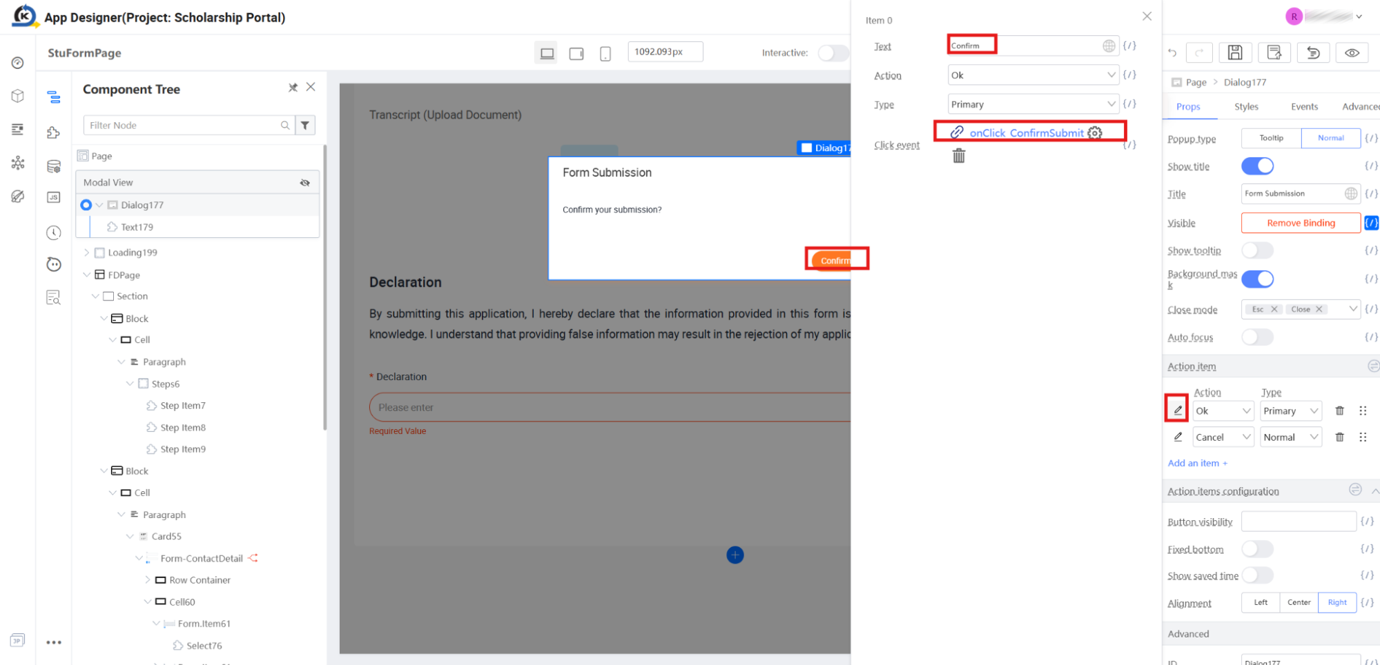
-
Verify the Confirm Handler: Note that the button's Click event is visually wired directly to the logical helper function:
onClick_ConfirmSubmit. -
Trace Code-Level Integrations: Open the Source Code Panel and look at the highlighted implementation of
onClick_ConfirmSubmit()starting around line 167.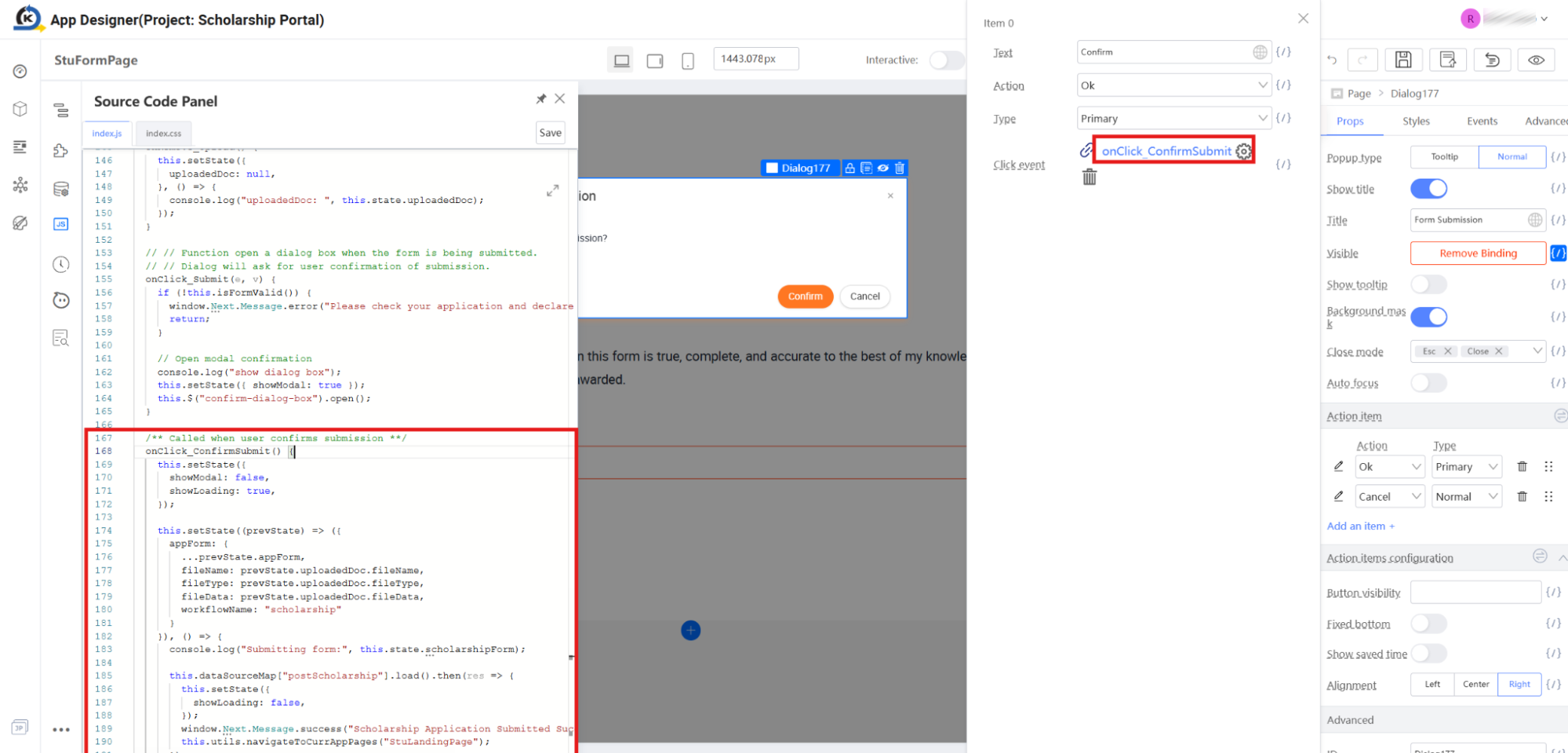
-
Identify the Triggers: Observe how this click handler sets system states and executes the database operations. As you will see in our next tour step, this script invokes a visual API datasource connector to submit transactions to the database, followed by a redirection call (
this.utils.navigateToCurrAppPages("StuLandingPage")) that we will verify live during the upcoming Preview section.
2.11 Invoking APIs (Datasource Configuration)
Goal
Inspect how visual UI pages bind to backend database services, mapping parameters directly to API specifications without writing integration boilerplate.
Concept: Visual Datasources
To query or write data, KAIZEN pages utilise Datasources. Instead of forcing developers to write complex client-side fetch requests, REST handlers, or state serialisation logic, a visual Datasource acts as a pre-configured bridge directly linking a page to any backend endpoint.
The developer maps parameters (like page states or form fields) visually to the API requirements. KAIZEN then generates the programmatic map (e.g., this.dataSourceMap["apiName"]), allowing the frontend to trigger the network transaction cleanly in a single line of JavaScript.
Inspection Tour
-
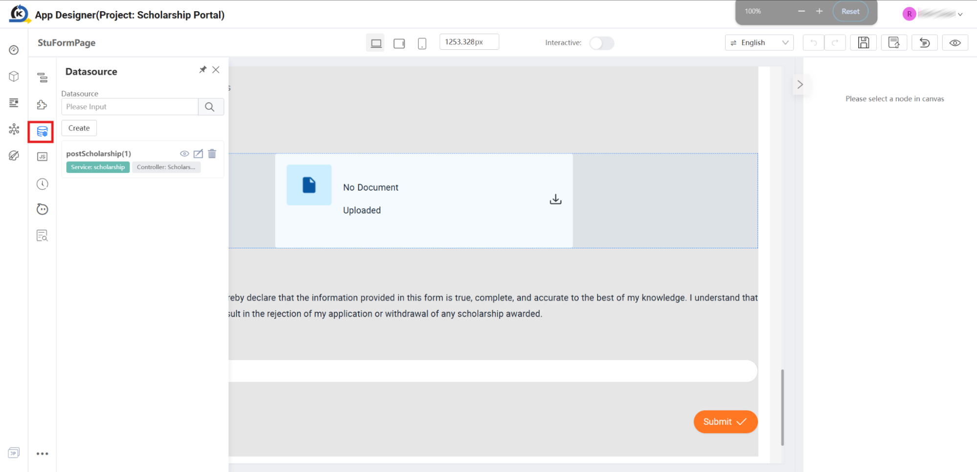
Open the Datasource Explorer: Locate the left vertical utility bar on your workspace and click the Datasource icon. This opens the page's localised Datasource manager panel.
-
Examine the Active Connector: Observe that the page has a pre-configured datasource item named
postScholarship(1)(referencing the active API mapped to the scholarship service controller). This represents the visual link behind our script invocation seen in step 2.10:this.dataSourceMap["postScholarship"].load().then(res => { ... }) -
Inspect Mapped Parameters: Click the pencil/edit icon on the
postScholarshipcard to open the Edit Datasource panel in the centre.- Observe how the Identity is registered as
postScholarship. - Look at the Params field. Notice that it is visually bound to:
{{ this.state.appForm }}
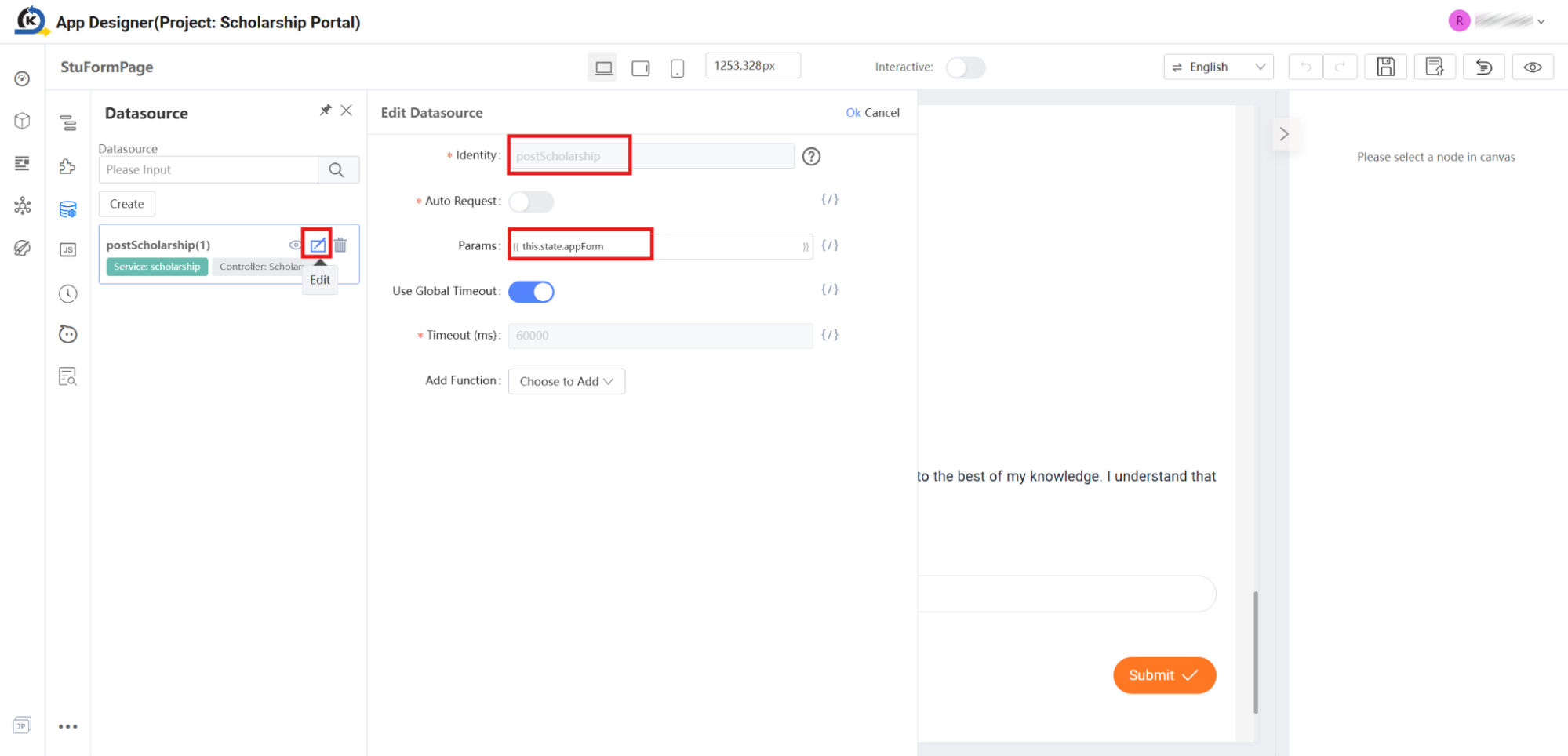
This tells KAIZEN to automatically compile and submit the form data state payload directly to the API endpoint on load execution. (We will inspect how this endpoint is built in the Service Designer module).
- Observe how the Identity is registered as
-
Explore New API Configurations: To see how simple it is to register additional visual integration paths, click the Create button at the top of the Datasource panel.
-
Select a Backend Endpoint: In the "Create from Datasource" popup modal that slides open, expand the dropdown menu under the active branch. Notice how KAIZEN visualises the existing backend controllers and methods, such as
downloadPDF,getScholarships, andpostScholarship.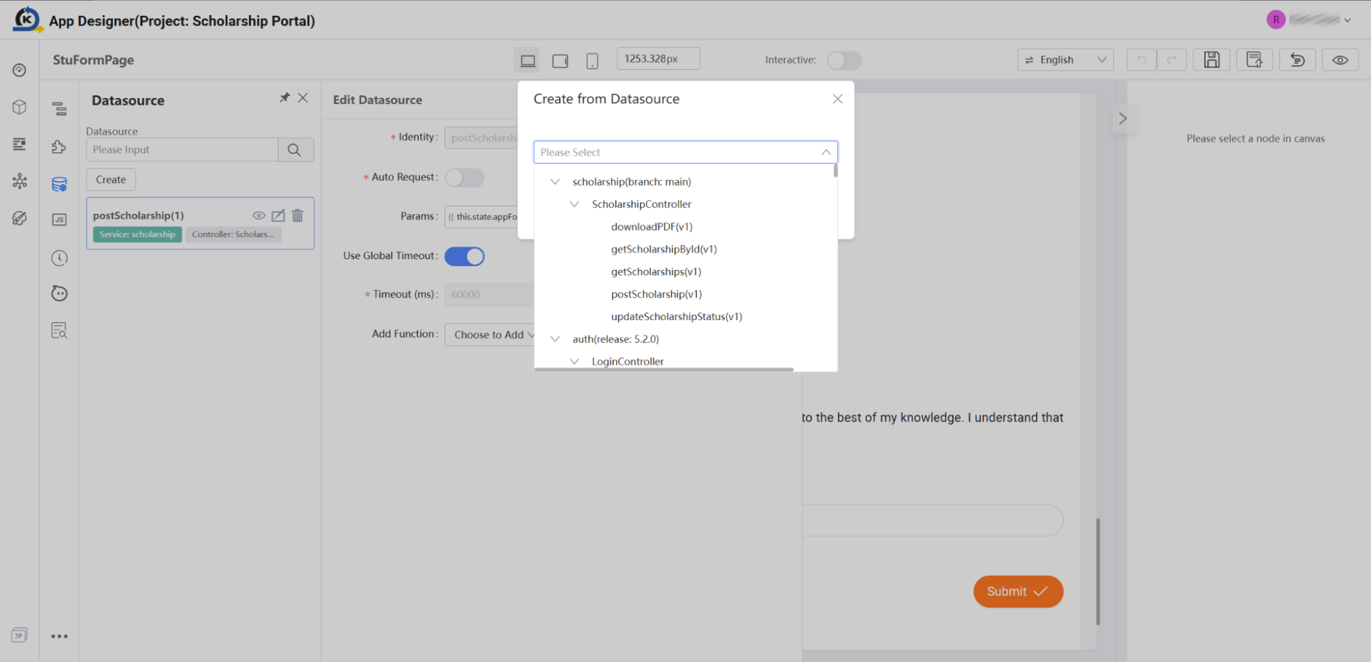
-
Bind the Endpoint: Click
getScholarships(v1)and click the Next button.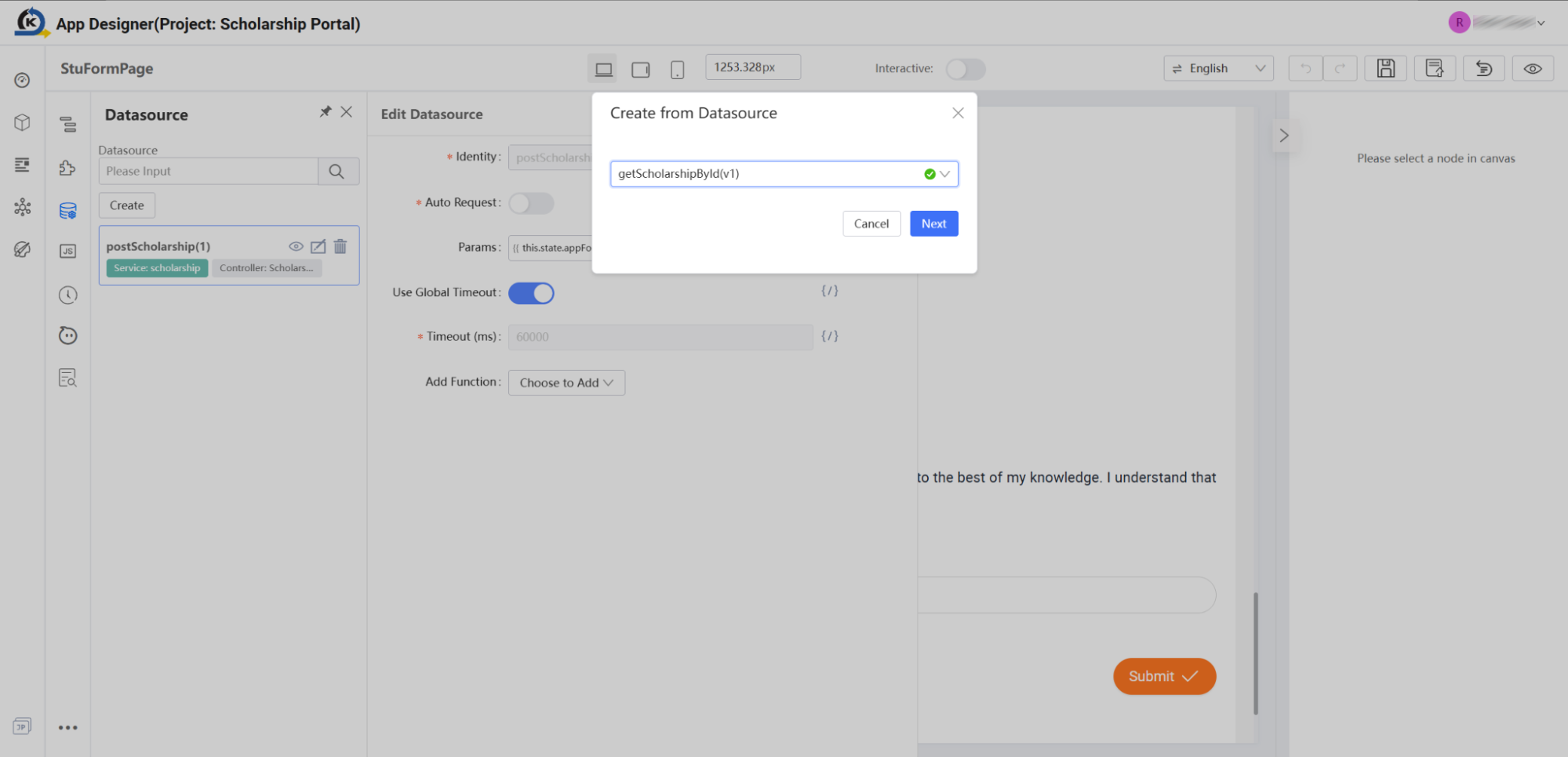
-
Observe Automatic Spec Matching: Look at the visual configuration form that loads on your screen. Notice how KAIZEN has automatically inspected the backend definition and generated input parameter fields (such as
pageNo,pageSize,name,status, etc.) matching the API specs. Developers can bind these fields to page state variables in seconds without manual payload mapping.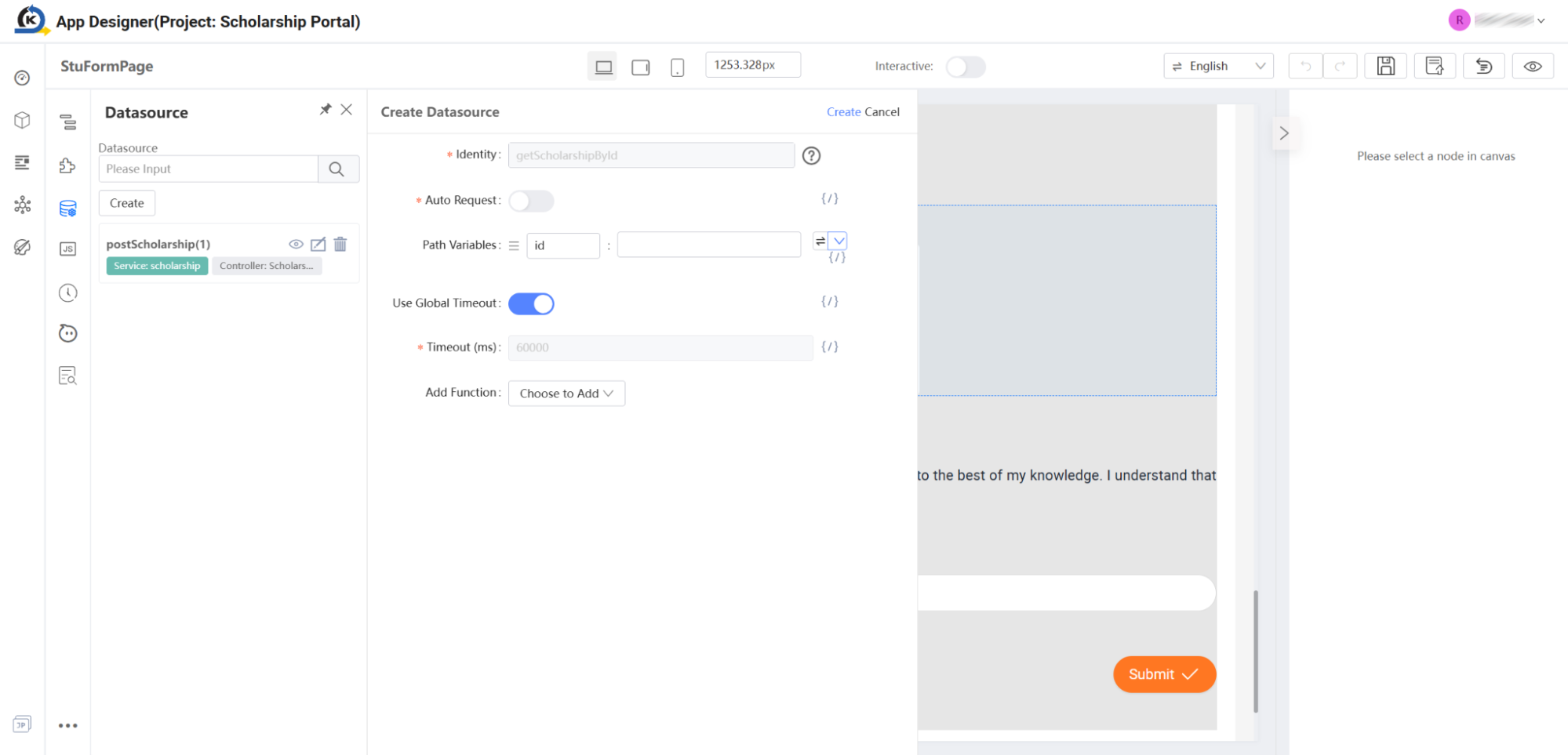
-
Click Cancel to close the setup drawer and return to your main workspace page. (The active
postScholarshipwas created using these exact same wizard-driven steps).
2.12 Third-Party Library Integration (UUID Generation)
Goal
Learn how KAIZEN applications seamlessly integrate external logical JavaScript packages (such as UUID generators) to extend the platform's core capabilities beyond standard components.
Concept: Library Extensibility
KAIZEN features an integrated Library Manager located on the left vertical utility menu. This enables teams to register global third-party visual frameworks or scripting utility packages directly via UMD/CDN resource paths (e.g., unpkg or cdnjs).
Once a library is visually installed and registered within the panel, its programmatic methods (like moment(), _ from Lodash, or uuid.v4()) become globally accessible inside any local client-side JavaScript file, page constructor, or button controller. This permits developers to scale complex, customised app calculations and utilities instantly without local environment terminal overhead.
Inspection Tour
-
Inspect Simulated API Retrieval: Locate the Use Digital ID button on the central Canvas (registered programmatically as
Button192under cell wrapperFormItem191).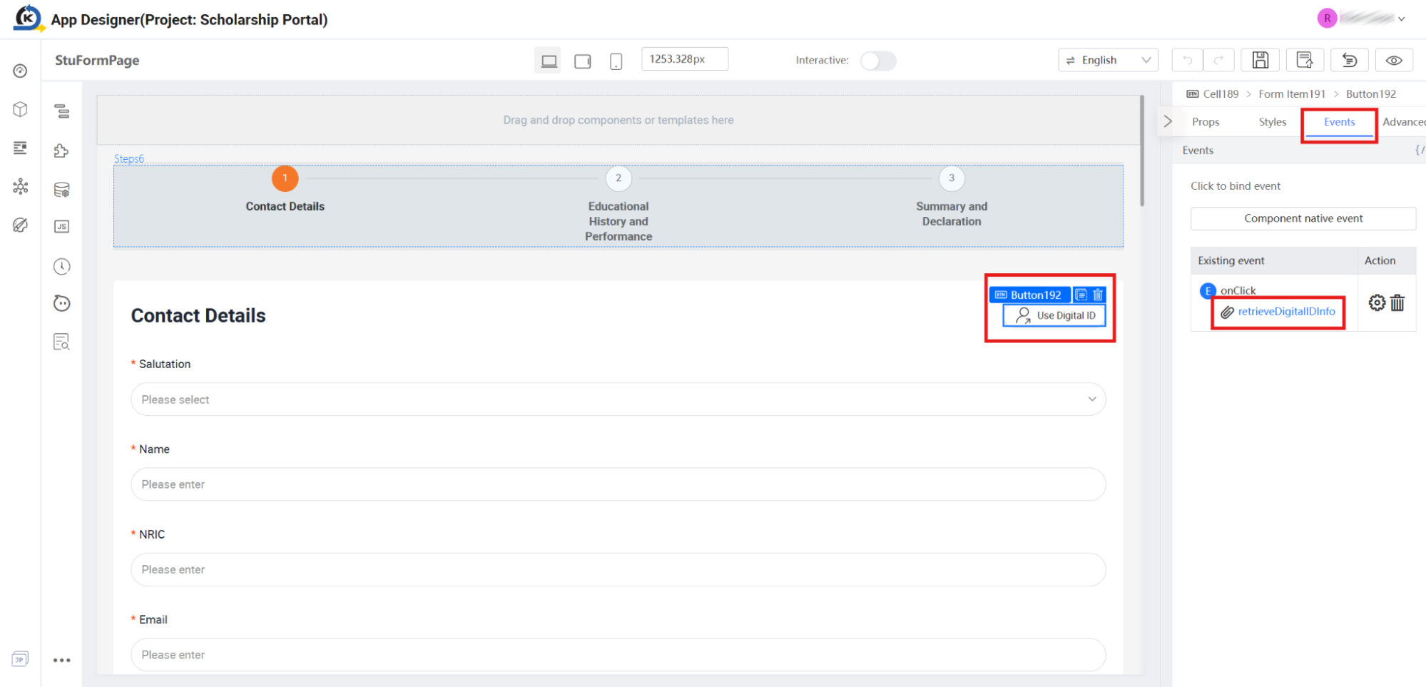
-
Verify the Click Action: Look to the properties inspector on the right. Under the Events tab, notice that the button's native click trigger is bound to:
retrieveDigitalIDInfo. -
Open the Source Code Panel: Click the
retrieveDigitalIDInfoaction link (or click the vertical JS toolbar button) to slide open the script editor.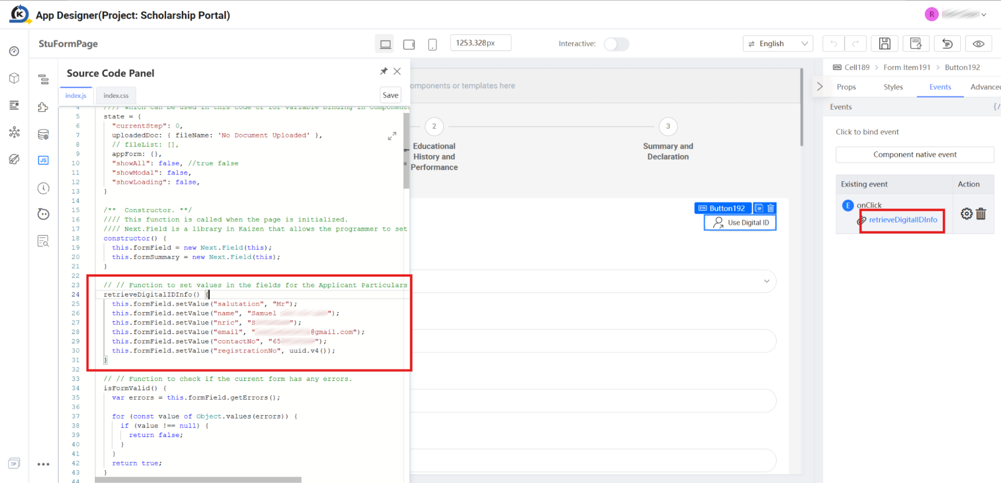
-
Trace the Information Retrieval Logic: Look at the highlighted implementation starting at line 24. This function simulates retrieving authenticated student particulars (Name, NRIC, Email) and mapping them into the form fields.
-
Observe Third-Party Library Invocation: Look closely at line 30 in the source code:
this.formField.setValue("registrationNo", uuid.v4());Notice that the application dynamically generates a unique registration tracking identifier by directly invoking
uuid.v4(), a standard third-party module method not native to standard low-code widgets. -
Access the Library Manager: Close the source code panel. On the vertical toolbar on the left side, locate and click the Libraries icon (located at the same hierarchical menu level as the Resources folder).
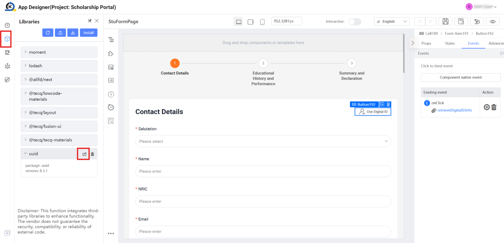
-
Verify Installed Libraries: Review the list of pre-installed active dependencies (such as moment, lodash, and uuid) showing their package versions and runtime status.
-
Inspect UUID Registration: Hover over the
uuidlibrary entry and click the pencil/edit icon. -
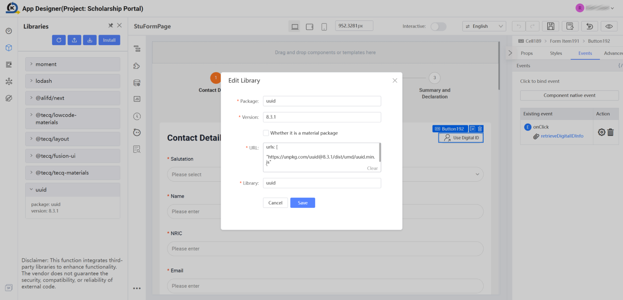
Examine the Package Configuration: In the "Edit Library" popup dialog that appears, see how cleanly external modules are integrated into KAIZEN's execution framework:
- Package:
uuid - Version:
8.3.1 - URL:
[https://unpkg.com/uuid@8.3.1/dist/umd/uuid.min.js](https://unpkg.com/uuid@8.3.1/dist/umd/uuid.min.js)
By declaring these properties visually, KAIZEN handles package distribution and injection seamlessly behind the scenes.
- Package:
-
Click Cancel to close the editing drawer and return to the main workspace layout.
2.13 Pointing to the Training Backend (Profiles Setup)
Goal
Configure the designer sandbox settings to interact seamlessly with your pre-populated training database instead of an empty environment.
Concept: Visual Profiles
Before executing or previewing your application live, it is essential to ensure that your visual editor targets the correct execution environment. KAIZEN's Profiles utility lets you toggle sandbox configurations, routing local requests directly to active training servers so you can test database writes and workflow triggers in real-time.
Inspection Tour
-
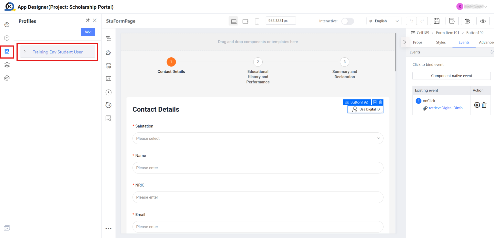
From the visual App Designer workspace, locate the vertical navigation bar on the far-left side and click the Profiles icon (represented by the user profile card with sliders). This launches the visual profile management panel.
-
Inside the Profiles panel, locate the active environment configuration card labelled
Training Env Student User. Select it. -
KAIZEN will pop open an inline confirmation dialog asking "Reload site / Are you sure you want to switch profile?". Click the OK button.
-
Your browser will prompt a final warning confirmation block asking "Reload site? Changes you made may not be saved". Click the Reload button.
-
Once your browser reloads and brings you back to the canvas workspace, reopen the left vertical Profiles panel. Verify that a checkmark (tick) is now prominently active on the
Training Env Student Userprofile card.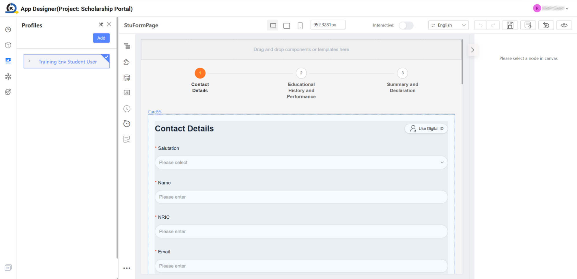
-
Your workspace is now pointed directly to the live training backend environment, and we are ready to preview the full form submission cycle.
2.14 Live Preview & Interaction
Goal
Execute and interact with the reference application live as an end-user in a safe, sandboxed environment to verify form behaviours, event actions, multi-step inputs, and dialog submissions.
Concept: Sandboxed Runtime Validation
KAIZEN's Preview Mode compiles your visual designs, global brand themes, and custom client-side JavaScript controllers into a fully operational sandboxed application. This allows developers and evaluators to interact with forms, upload documents, trigger validations, and watch UI elements respond instantly—exactly as an end-user would—without needing to perform server deployments.
Inspection Tour
-
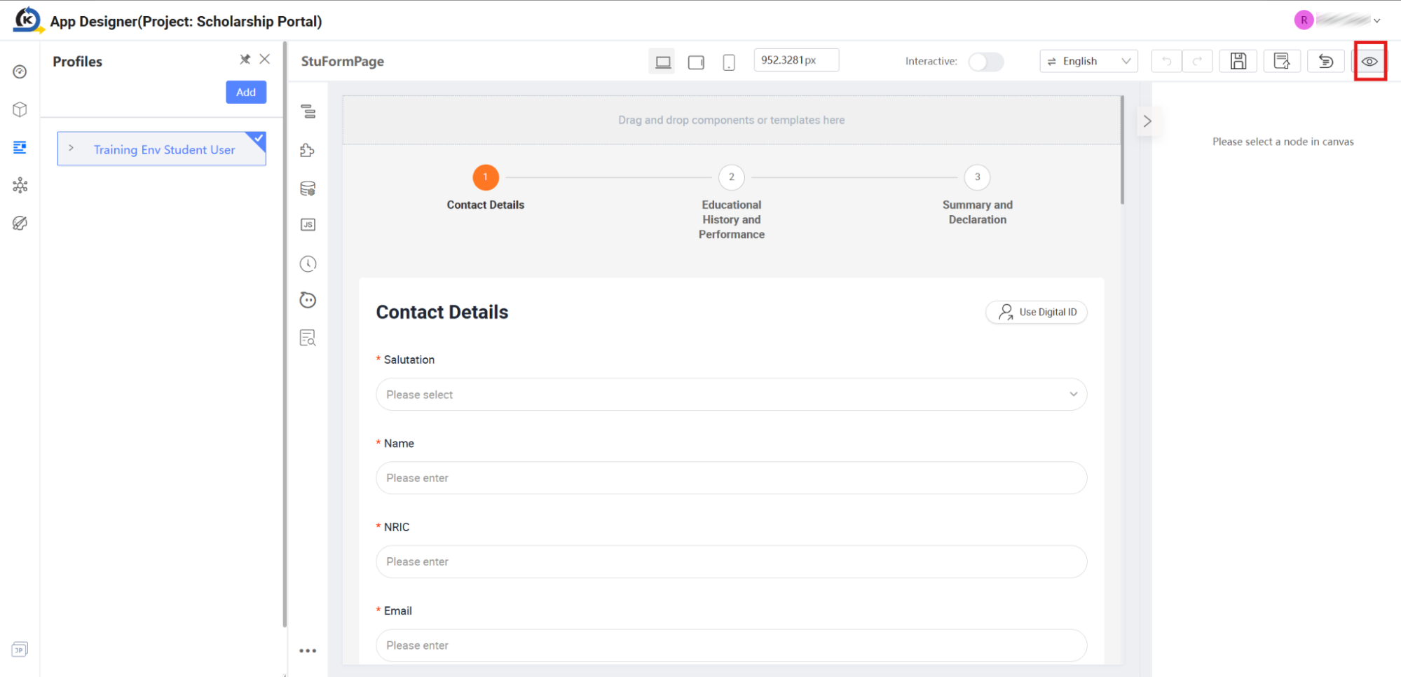
Launch the Live Preview: Look at the Top Action Bar on the far right of the App Designer. Locate and click the Preview button.
-
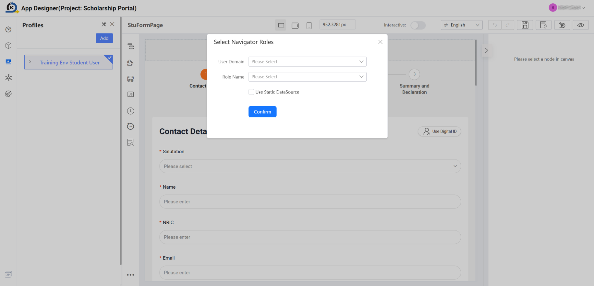
Access Role Setup: A modal dialog named Select Navigator Roles will slide open on your screen. This allows you to simulate user access dimensions if security layers are active.
-
Confirm Default Access: For this guided tour, leave both the User Domain and Role Name dropdown fields empty and click the Confirm button.
-
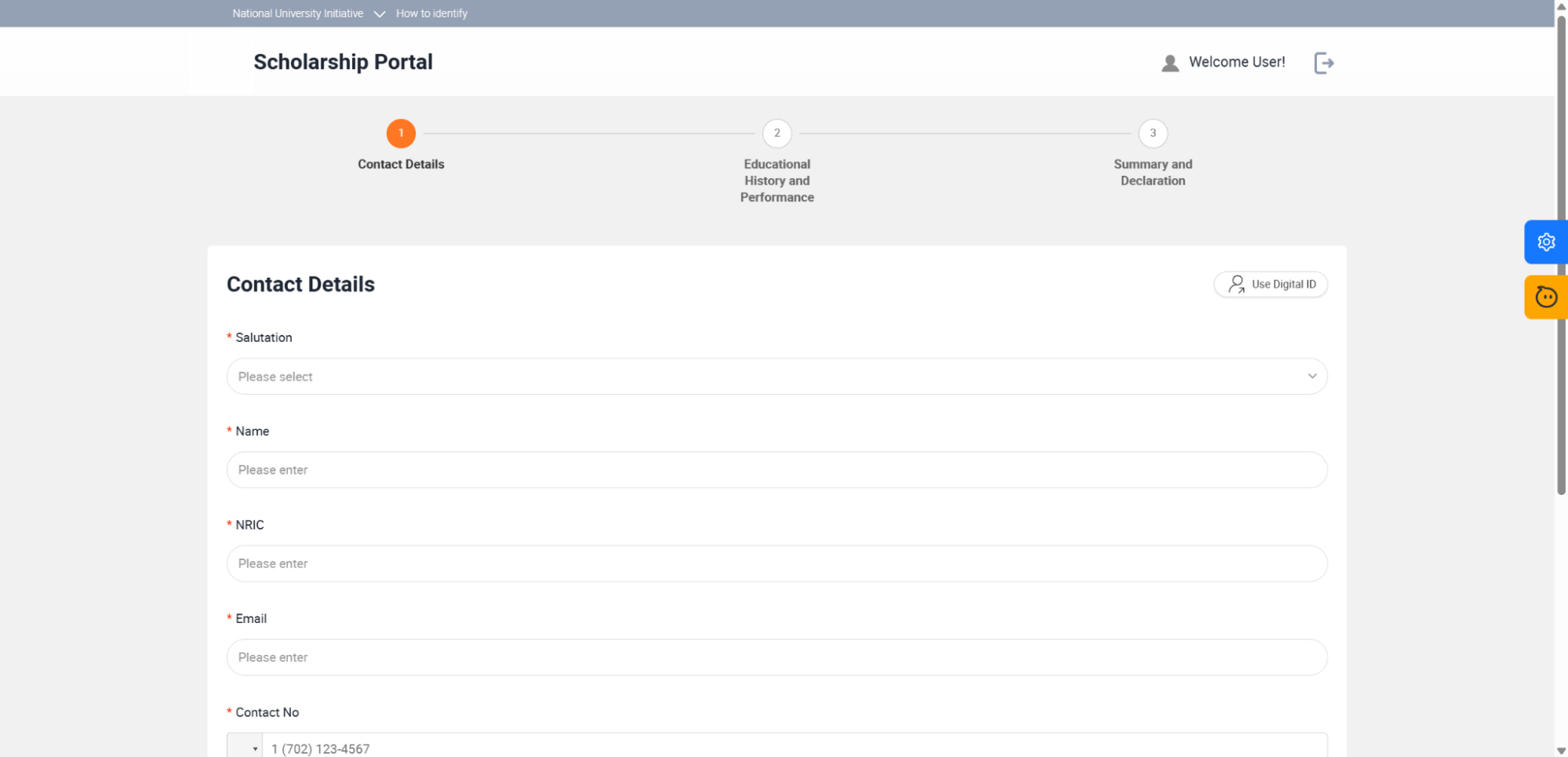
Interact with the Live Portal: A brand-new web tab opens in your browser, running your compiled Scholarship Portal frontend. Note how the CSS layouts, the brand fonts, and form elements render cleanly.
-
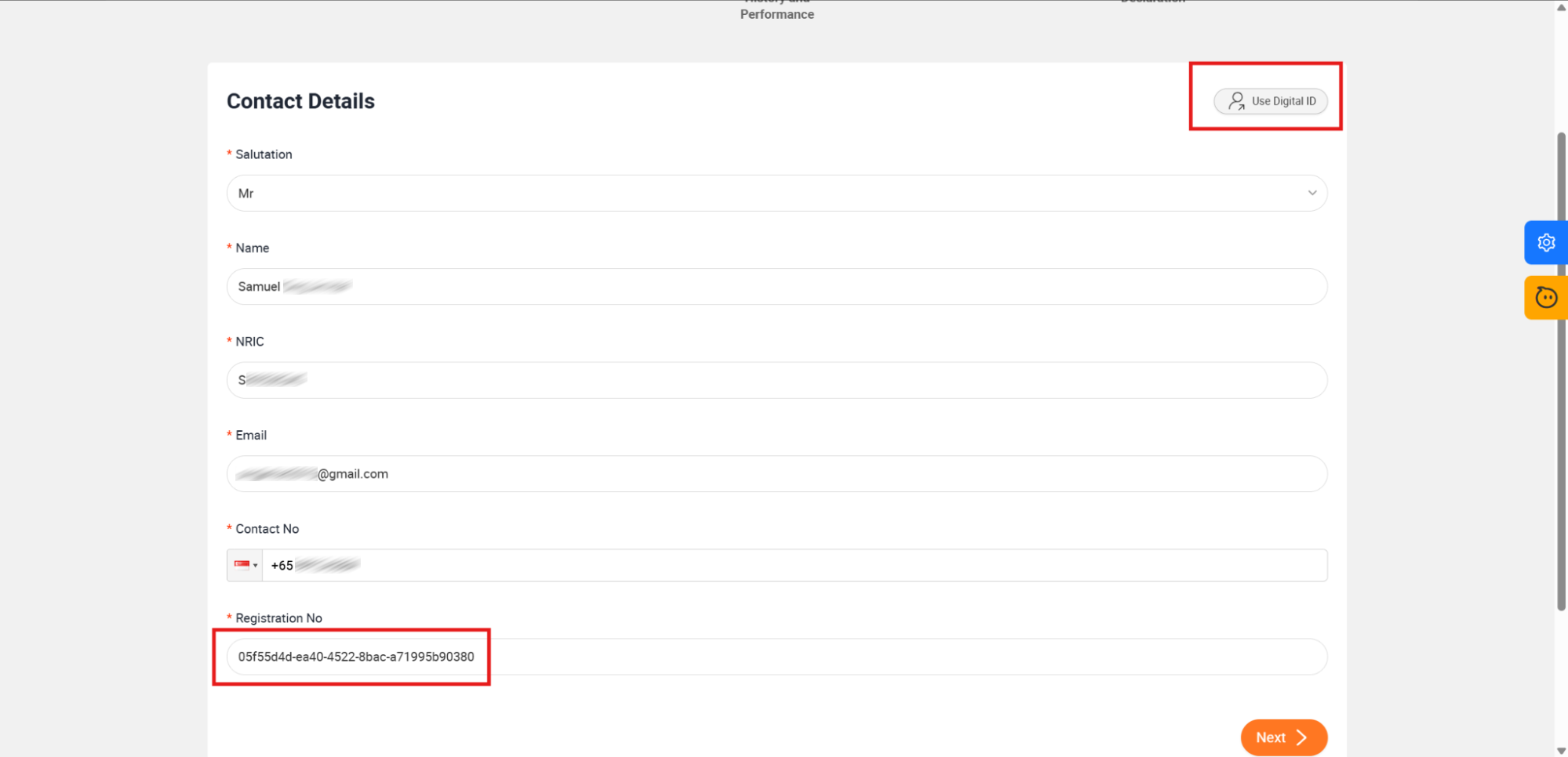
Execute Third-Party Logic: Locate and click the Use Digital ID button.
-
Verify Dynamic Data Population: Watch the form react immediately. The fields populate with applicant records, and a custom tracking code appears inside the Registration No field. This confirms that your third-party
uuidlibrary is executing in the browser runtime successfully. -
Test Multi-Step Navigation: Scroll to the bottom of the contact form and click the Next button.
-
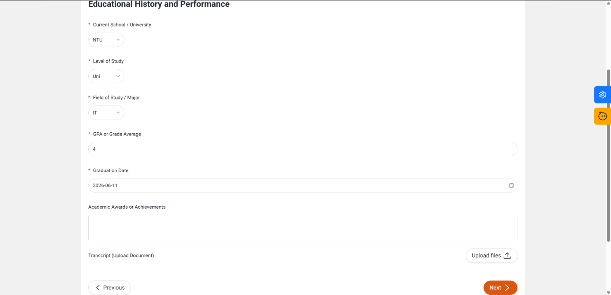
Continue Form Filling: Once the wizard slides smoothly to the Educational History and Performance step (as shown in the image below), fill out the following mock scholastic entries:
- Current School / University: Select
NTUfrom the dropdown. - Level of Study: Select
Unifrom the dropdown. - Field of Study / Major: Select
ITfrom the dropdown. - GPA or Grade Average: Input
4in the text field. - Graduation Date: Choose
2026-06-11(or any dummy date) from the date selector. Scroll down and click the Next button to move to the final validation stage.
- Current School / University: Select
-
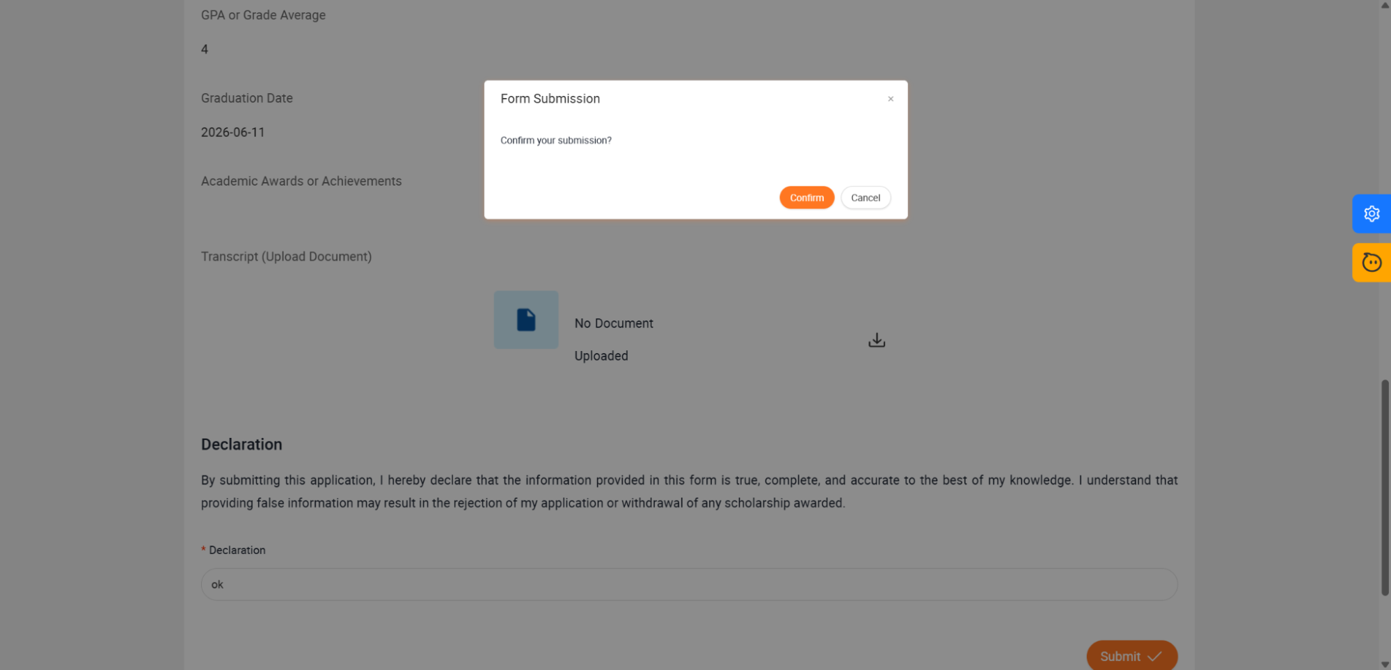
Review and Declare: Under the Summary and Declaration step (as shown in the image below), review your filled information. To confirm the validity of your application, navigate down to the Declaration input block, type
okin the text field, and click the Submit button on the bottom right.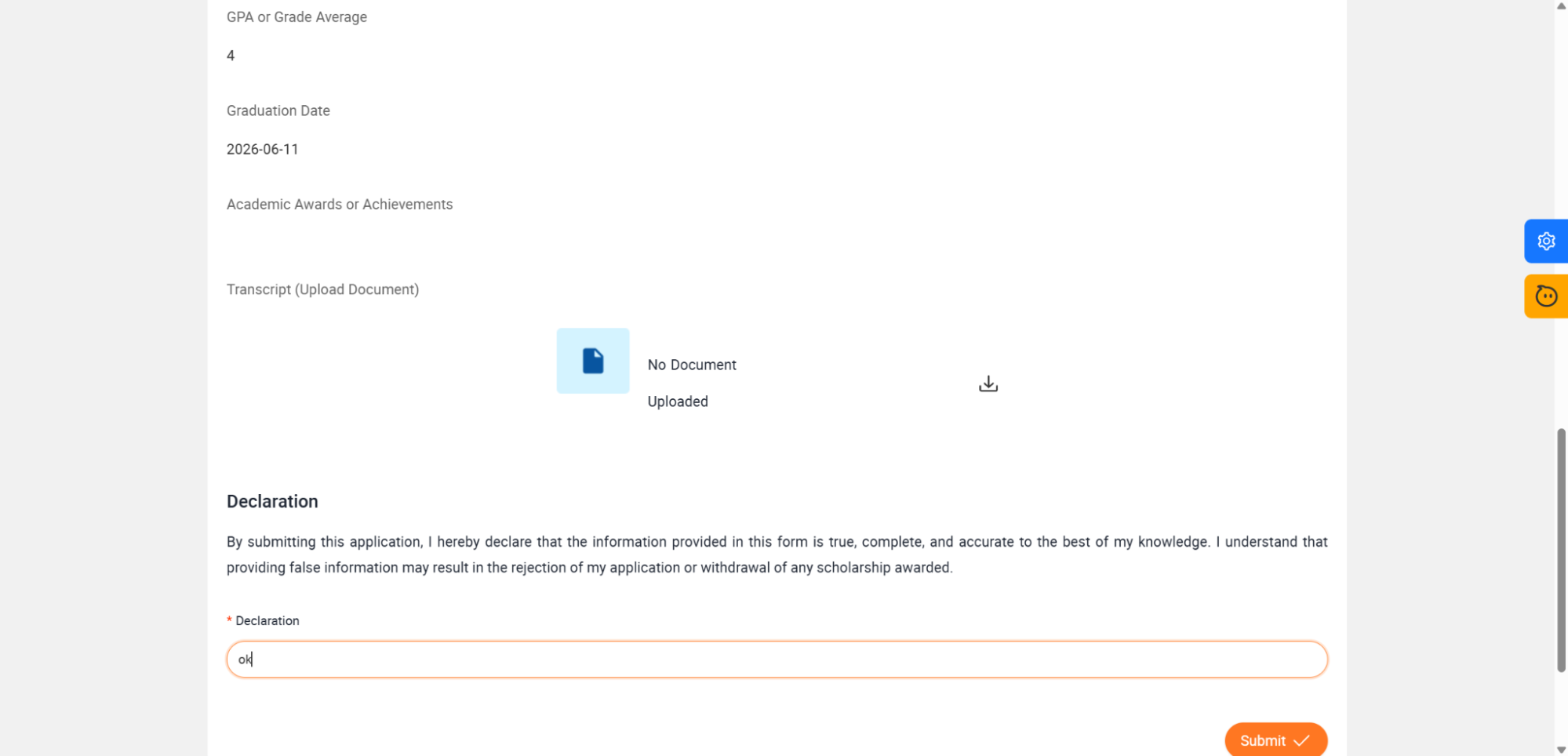
-
Confirm the Interactive Dialog: Notice how KAIZEN's state engine immediately launches the translucent overlay containing the Form Submission modal dialog: "Confirm your submission?".
-
Finalize Submission: Click the Confirm button in the modal dialog container.
-
KAIZEN compiles your dataset state
this.state.appForm. -
The visual datasource triggers the backend endpoint call:
this.dataSourceMap["postScholarship"].load(). -
You are instantly and gracefully redirected to the main Student Landing dashboard.

-
-
Close this browser preview tab to return to your App Designer workspace.
Last updated on 21 Sep 2026